Climate image spaces and the new climate movements
A Digital Methods Summer school DMI19 project report1. Team Members
Katharina Christ. Gabriele Colombo, Carlo De Gaetano, Hanteng, Paul Heinicker, Zhao Jing, Janna Kienbaum, Bence Kollányi, Mangying Li, Mattia Lussana, Mace Ojala, Janna Joceli Omena, Asli Ozgen-Tuncer, Warren Pearce, Elena Pilipets, Nisha Rani, Frauke Rohden, Birgit Schneider, Ektor Theoulakis, Can Ture, Zilia Wang, Ziaoyang Zhao2. Contents
- Climate image spaces and the new climate movements
- 1. Team Members
- 2. Contents
- 3. Introduction
- 4: The history of climate change images through Google search results
- 5: Climate Image Spaces
- 6: Climate emergency and the new climate movements
- 7. Conclusions
- 8. References
3. Introduction
Climate change communication is international to a certain extent. By translating reports to other languages, there seems to be a mainstream and standardised image language to depict climate change. At the same time there are significant differences in preferred image types (photographs, maps, curves, pictograms, cartoons) and framings of climate change which might be specific to locations. Two climate change related projects were pitched for first week project for the Digital Methods Summer school 2019. First of them was titled Climate Image Spaces by Paul Heinicker and Janna Kienbaum from the ANCI project at University of Applied Sciences Potsdam, which focused on the online circulation of images returned by search engine queries for climate change. The second pitch was titled Extinction Rebellion, #FridaysForFuture and the New Climate Movements by Warren Pearce from the University of Sheffield, and focused particularly on recent developments around the shifting language of climate change, the frame of “climate emergency”, and the high-profile protests and school strikes in the last 12 months. After the summer school participants had selected projects to work on, these two were merged on the basis of both are addressing the same topic, climate change and its vernacular imagery online. The rest of the document is structured in three sections, each by one of the three working groups in which the research was conducted. The first section focuses on historical, longitudinal research of climate image on Google Image search. The second section builds on synchronic, cross-national image dataset collected from Google Image Search and preliminary visual analysis results constructed in the ANCI project. The third section explores the contemporary climate emergency activism as it appears across different social media platforms.4: The history of climate change images through Google search results
4.1 Research Questions
-
RQ1.1 How different climate frames have been visually represented by Google Image Search over the last 10 years? Is the visual story changing? Are the sources of top images changing over time?
-
RQ1.2 Can we find signs of climate human action/activism, and when?
-
RQ1.3 Is climate rebellion visuality present in Google search results? From when?
4.2 Methodology
4.2.1 Dataset creation
We have collected the top 100 image URLs per year (2008-2019), and the URLs of the pages hosting the images with the queries: [climate change], [climate emergency] and [climate crisis].
-
With time filter activated, query [climate change], [climate emergency], [climate crisis] on Google.com, limiting results to one year (from 2008-2019).
-
Scroll down to load at least 100 images
-
Click the Google Image Search URL Extractor to open a table with ranked image URLs and host pages URLs in a new tab.
-
Copy and paste the first 100 rows in a Google spreadsheet (one spreadsheet per year)
4.2.2 Top images overtime
The analysis of climate change related images overtime is divided in two parts: 1) we have close read top 20 images per year, and 2) used Clarifai image content recognition API to perform a distant reading of all images (top 100 per year).
4.2.3 Top 20 images overtime:
-
Create a new sheet in the Google spreadsheet
-
Copy and paste the first 20 image URLs per year in one column next to each other
-
Load images in each cell with =IMAGE(M2)
-
Resize rows height
4.2.4 Top 100 images overtime:
-
Copy and paste image URLs from each year in a single column
-
Export column as csv file
-
Upload csv file with image urls to the Density Design Image tagging tool interface, which uses the Clarifai API to tag images.
-
Download csv with results (a csv file with a list of tags for each image and a confidence score)
-
Import csv to a new Google spreadsheet
-
Count with a pivot table the most common Clarifai tags per year
4.2.5 Top sources over time
The analysis of the sources over time is based on the visual affordances of Bernhard Rieder’s RankFlow tool. Through this type of visualization we were able to analyse changes in Google Images ranking system over time (from 2008-2019).
-
Use DMI Tool Harvest to only get a list of hostnames for each year
-
Copy and paste link domains according to each year in a Google spreadsheet
-
Copy and paste the spreadsheets in RankFlow, each file contained a column for the year with its correspondent top 100 link domains.
-
Three visualizations were generated for [climate change], [climate emergency], [climate crisis]
4.3 Findings
4.3.1 Top 10 images overtime
Climate change (→ visualisation here)
The query [climate change] returns very similar visual results overtime. Despite an overall visual homogeneity, two different communication strategies can be observed (with a shift around 2013).
-
From the studied globe to the requiem for the earth; or from studying to prepare for grief: until 2013 the globe is represented as a diagram, with a focus on its functioning and on the effects of climate change, represented with diagrams and heatmaps. After 2013 the earth is not studied anymore but it becomes a spherical object watched while it burns.
-
From a formal point of view, the overall visual imagery becomes more red in the last years
-
Until 2013 there is no sign of human causes of climate change. After 2013 there are (very few) signs of human impacts in the form of smoking chimneys
-
There are no signs of climate action or solutions
-
Climate change from a matter of scientific investigation (graphs) to a matter of concern (the planet is burning).
Climate emergency (→ visualisation here)
The query [climate emergency] returns a less cliched visuality, with signs of climate alarmism but no solutions.
-
Signs of protest are only evident in the first years (2008-2010), and then reappear in the last two years (2018-2019), with banners from street march strikingly depicting a drawn-by-hand rendition of the earth on fire (as seen in the climate change space).
-
Few logos of climate organizations, or images advertising climate petitions.
-
Starting 2016, people appear as ‘experts’ (next to a quote/graph) and as ‘protesters’. 2019 contains FridaysForFuture & ExtinctionRebellion visuality.
Climate crisis (→ visualisation here)
The query [climate crisis] – ’book club’ observing the globe.
-
Mainly book covers and documentaries. In general, book covers including “climate crisis” occupy one fourth of all images.
-
Dominated by the blue&white visuality of the sky, snow, water, mountains, polar bears. No people appear!
-
From 2016 the most iconic image of the globe in the hand appears.
-
Cover content evolution: ice melting→endangered animals→air pollution→clean energy use).
-
Four main time periods could be inferred from 2008 to 2019 images: (1) general understandings of “climate crisis” via books at the beginning stage; (2) more focus on the natural environment change in the middle stage, such as ice melting and global warming phenomenon; (3) attention to human living environment increased, such as air pollution produced by vehicle emissions and factories(4) Potential solutions to solve climate crisis, such as using wind energy (clean energy).
Main trend of climate crisis images: Understanding→Recognition→Movement→Awareness→Knowledge→Solution
-
2014 seems to be atypical in respect to top ten images. Mainly images regarding 2014 “Flood Wall Street climate change” protest in New York. To be further explored with regard to the connection of capitalism critique.
4.3.2 Top 100 images
Climate change 2008-2019 image tag network (→ visualisation here)
-
The biggest node is “no person”
-
“People” tag is absent or very small
Climate emergency 2008-2019 image tag network (→ visualisation here)
-
“No person” tag is still big, but less than in the climate change network
-
“People” node is relevant in the network
4.3.3 Top sources over time
Seeing link domain over time
Considering Google Images, who are the actors (link domain) that provided the visuality of [climate change], [climate emergency] and [climate crisis] from 2008-2019? What link domains are consistent over time? Can we identify new actors over the years? The table below respond to those questions according to different queries.
| Query | Domain Actors (those consistent over time) | New actors over years |
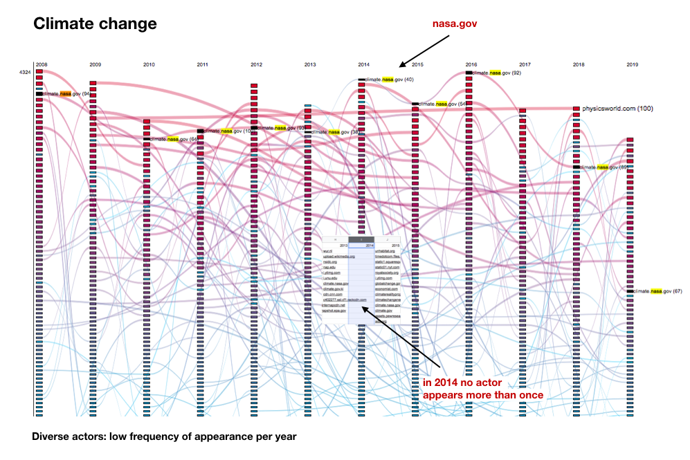
| Climate Change | climate.nasa.gov epa.gov wikimedia.org cnn.com Internap un.org | More actors, low frequency of appearance (2014 – each actor appears only once) climaterealityproject.org sciencenews.or |
| Climate Emergency | wattsupwiththat.com campaigncc.org climateemergencyinstitute.com YouTube | climate-change-knownegde.org, climatemoreland.org, climateemergencydeclaration.org |
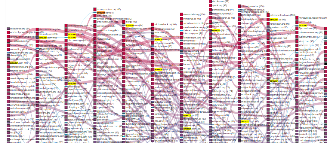
| Climate Crisis | amazon.com wattsupwiththat.com youtube.com |
Beyond the particularities of each query, we detected a common pattern among [climate change], [climate emergency] and [climate crisis]: the strong presence of .au, .uk, and .ca. In Climate change, however, uk. is the most dominant authority, while .au and .ca are frequent (and .eu is less frequent). We notice also the appearance of wattsupwiththat.com as a dominant actor in both [climate emergency] and [climate crisis], whereas the presence of social media platforms (e.g. YouTube, Facebook and Twitter) are strongly related to the former.
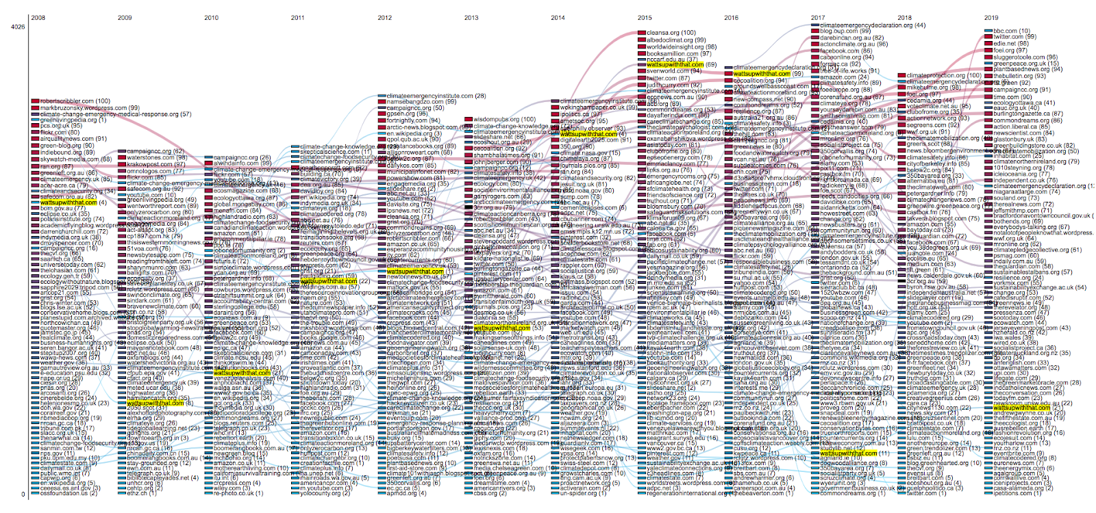
Query: “climate emergency”, the US climate sceptic website wattsupwiththat.com appears as a prominent actor prior to the recent surge in usage of the term by protestors. This suggests that climate sceptics have a history of using the terms as a way of making fun of activists, and that this gave sceptics a prominence in Google searches for the terms which they have not had in search results for ‘climate change’.
Climate crisis
Interpretations of actors:
Amazon.com appears in a consistent manner. (Please see the trend below)
5: Climate Image Spaces
An international image comparison using Google
5.1 Summary of Key Findings
T-SNE is a challenging and productive method for exploring large image data sets. The combination of machine learning and visualization offers an alternative to graphs-based layout methods and an alternative to keyword-driven image research, where clusters do emerge via language (although we produced our corpus by using keywords). The approach helps finding framings and explore images per se. A profound insight of our research during the DMI summer school is, that this approach changes the epistemic practice of image analysis profoundly. Is not a completely unusual thing to try, because it still aligns with human interpretation. The following question stood at the end: Why are the findings of Google image search in the case of climate change so cliché? Further research is needed, e.g. to look into Google image ranking and the logic of the “frontispiece” of google-ranked images on websites.
5.2 Introduction
For more than two years, the Analysing Networked Climate Images (ANCI) project at University of Potsdam has been conducting research with mixed methods on questions of climate images on the Internet. The project is based on the assumption that the distributed global archive of climate change images produced by very different actors on the Internet contains substantial findings that can be obtained by analysing the distributions, migrations, image types and frequencies of certain images. A key question of the research is the subject of similarity as a criterion for comparing images in image studies, computer science, and data visualization.
For analysis of the visual communication of climate change on the Internet, ANCI relates to Aby Warburg’s approach by studying exemplary, multi-faceted and widespread “catch images” (Warburg, Aby: Der Bilderatlas Mnemosyne. Ed. by Martin Warnke and Claudia Brink. Berlin (2000). – with visual manifestations in public space, whose rhetorical, symbolic, literary, technical and historical use is to be analysed.
For the current study that ANCI brought to the DMI Summer School 2019, a mixed method combination for an intercultural image comparison that analyses the similarities or differences in climate change communication was planned.
The study on the intercultural comparison of climate images is based, among others, on the frame approach of communication science. (See Nocke, Thomas; Schneider, Birgit (Ed.) (2014): Image Politics of Climate Change, Bielefeld; Grittmann, Elke: “Between Risk, Beauty and the Sublime: The Visualization of Climate Change in Media Coverage during COP 15 in Copenhagen 2009”. In: Nocke, Thomas; Schneider, Birgit (Pub.) (2014): Image Politics of Climate Change, Bielefeld.: Image politics of climate change; Manzo, Kate (2009): Imaging vulnerability: the iconography of climate change; Srnicek, Nick. (2016). Platform Capitalism. Polity; Wardekker, Arjan; Lorenz, Susanne: The visual framing of climate change impacts & adaptation in the IPCC Assessment Reports.) Under the focus of the framing analysis we pursued several small research approaches with the aim to analyse different places and scales of climate communication on the Internet. The research site of our group was Google Image Search.
Due to insights and experience from previous studies, we were able to address the issue of posing quantitative and qualitative questions at a very high level. We wanted to dissociate ourselves from design models that explicitly separate both approaches and, in an interdisciplinary fashion, wanted to intertwine both methods during the project more closely or nested, or even dissolve the separation of qualitative and quantitative methods completely.
5.3 Research Questions
The following research questions were the initiators of our work with digital methods.
On the content level we asked:
-
RQ2.1. How globalized is the imagery of climate change?
-
RQ2.2. What different images of climate change do people see when they perform image search queries on Google, in different places of the world?
-
RQ2.3. What motifs and types of images are locally specific? What different framings of climate change are visible?
-
RQ2.4. Is it possible to investigate how specific images migrate from one platform to another? How do images travel across the web?
On more methodological level we asked:
-
RQ2.5. Which role do digital infrastructures like web search engines (e.g. Google Search and Google Image Search) play in terms of pre-sorting and ranking climate images?
-
RQ2.6. What does the t-SNE method (van der Maaten and G.E. Hinton, 2008) achieve for Digital Methods for visualizing image collections?
-
RQ2.7. Do qualitative human annotations agree with t-SNE clustering? If so, why?
-
RQ2.8. Where does the image corpus come from? Who is delivering these images to be found? Are there some globally ubiquitous sources? Do platforms such as Google promote their own products on Google Image Search; do platforms appear to be doing cross-subsidising (Srnicek 2016)? How do the image source distributions compare across countries, and do the selected countries speak to one another using the visual vernacular? To put it in from another perspective: who speaks and responds to the users of Google Image Search?
5.4 Initial Data Sets
Rather than start from data collection like groups 1 and 3, this group founded its work on the prior data acquisition work done in the ANCI project. Three datasets were used, and they are described below.
Dataset 5a: ANCI image collection
A collection of 25480 images about climate change on Google Image Search. The image collection was stratified by 12 locales: Germany, Brazil, South Africa, Hong Kong, Thailand, Taiwan, Russia, Norway, USA, Turkey, Mexico and Vietnam. The query terms climate change, global warming, energy transformation, climate change adaptation, climate change impacts, climate change disaster, climate change risk, sustainability, and climate change mitigation were translated and localized to each of the locales, f.ex. in German Klimawandel, Erderwärmung, Energieumwandlung, Anpassung an den Klimawandel, Auswirkungen des Klimawandels, Klimakatastrophe, Risiko des Klimawandels, Nachhaltigkeit and Klimaschutz, and 氣候變化, 全球暖化, 能源轉型, 氣候變化適應, 氣候變化的影響, 氣候變化災難, 氣候變化風險, 可持續性 and 減緩氣候變化 for Hong Kong.
The image results of the search were downloaded using a Python script and Tor browser under VPN tunneling. In the dataset, approximately 2000 images are available for each of the 12 locales (σ=143).
The image dataset is available for exploration in its own tabulator interface.
Of the twelve locales, six were selected for this research: Brazil, Germany, Hong Kong, Russia, South Africa and USA.
Dataset 5b: ANCI image metadata
A tabular dataset describing dataset 5a. The shape of the table is 25480 rows and 12 columns. Each row represents and image from the dataset 1, with the following columns describing properties of each:
-
country. The country of data collection,
-
searchterm. The search term of original, shared across the locales.
-
searchtermOfficialLanguage. The search term translated to selected locale.
-
language. The language in which the search was conducted.
-
access_time. Timestamp of when the search was conducted.
-
last_modified. ?
-
image_source. The URL of the image in Google Image Search results.
-
local_imagepath. Filename of the downloaded original image.
-
local_thumbnailpath. Filename of the thumbnail of the image.
-
image_height. Original image height in pixels.
-
image_width. Original image width in pixels.
-
image_detect. Single most relevant machine recognized content object, as reported by cloud AI service Clarifai.
The local_imagepath and local_thumbnailpath properties include further semantics, including the un-localized search term, locale and the ordinal ranking of each of the results as given by Google Image Search, for example in value downloads/climate change adaptation/Brazil_pt/img_092_Brazil_pt_climate_change_adaptation.
This data was accessed interactively via the provided image tabulator, and downloaded from the tabulator as a JSON structure for local processing.
Dataset 5c: ANCI t-SNE visualizations
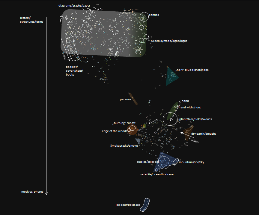
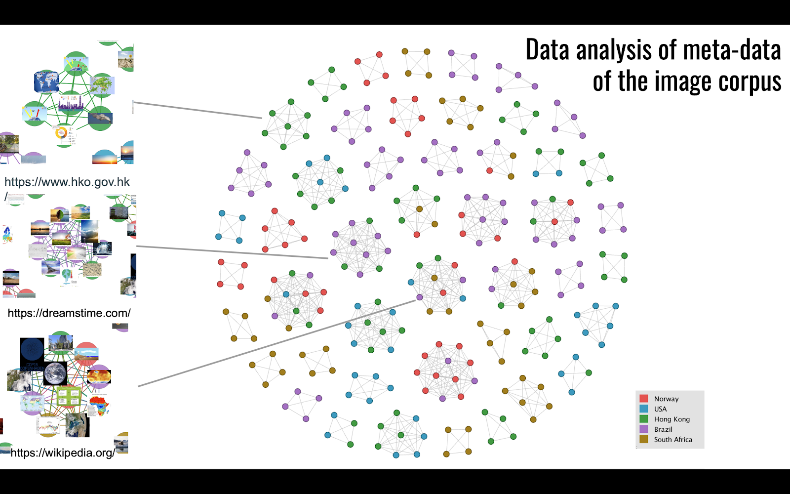
For each of the six selected locales, an interactive layout visualization of image thumbnails has been created previously in the ANCI project. The visualizations are composed by processing each image in dataset 2.1 with the Inception v3 convolutional neural network trained by Google on ImageNet, and extracting the final feature layer of the network. The resulting manifold has then been projected to a lower dimensional space with the t-SNE algorithm (van der Maaten and Hinton 2008).
The processing has been done with an adapted version of Yale University Library Digital Humanities Lab’s pix-plot tool. It also generates a web user interfaces, one per locale. For each locale, 20 so-called catch images attempt to summarize the apparent clusters, and to afford exploration of the abstract image space. For example visualization, see Brazil below.

Human annotators have started annotating using qualitative, interpretative methods. As an example, the ongoing annotation for German t-SNE visualization is given below.
5.4 Methodology
5.4.1 Qualitative analysis of t-SNE output
To address research questions RQ2.6 and RQ2.7, qualitative close viewing of the Google search results and the t-SNE visualization enabled us on the one hand to determine the first content-related results with regard to the identification of country-specific impact images and on the other hand to reflect on the digital visualization method, the cluster system of which we looked at.
We conceptualized the clusters found by t-SNE by naming them and by checking the themes against framing approaches of climate change imagery (framing: how individuals, groups, and societies organize, perceive, and communicate about the reality of climate change).
| Brazil | Russia | Hong Kong | Germany | South Africa | US | |
| Diagrams | X | X | X | X | X | X |
| Infographics, slides | X | X | X | X | X | X |
| Maps | X few | X | X | X | X | X |
| Logos | X | X | Xfew | X | X | X |
| Cartoons | X | |||||
| Book covers | X | X | X | X | X? | |
| Text / PDFs b&w | X | X | X | X | X | |
| Colorful Brochures | X | X | X | X | X | X |
| Diptych | X | X | Xfew | Xfew | Xfew (scatterd) | X |
| Globes/Planets | X | X | X | X | X | X |
| Polar Bears | X | X | X | X | X | X |
| Blue Landscapes Ice / Sea | X | X | X | X | X | X |
| Droughts/Dried ground | X | X | X | X | X | X |
| Floods | X | X (few, only szenario) | X | X | Xfew | X |
| Forests | X | X | X | |||
| Smog / Clouds / stacks | X | X | X | X | X | X |
| Coasts | X | X | X | X | ||
| Forest Fires | X | Xfew | X | X | X | |
| Farming, Animals, Fields | X | X | X | Xfew | X | |
| People, summits, Politicians | X | X | X | Xfew | X |
Table ordered by themes (black cross = t-SNE Hotspot, red cross = qualitative analysis)
We then developed a grid in which we inserted all screenshots of the corresponding "t-SNE hotspots" in order to identify initial "international" differences and similarities between different image clusters. We were thus able to determine different size distributions of certain image motifs and already see which motifs or clusters were present in all countries and how individual motifs differ in content in clusters.
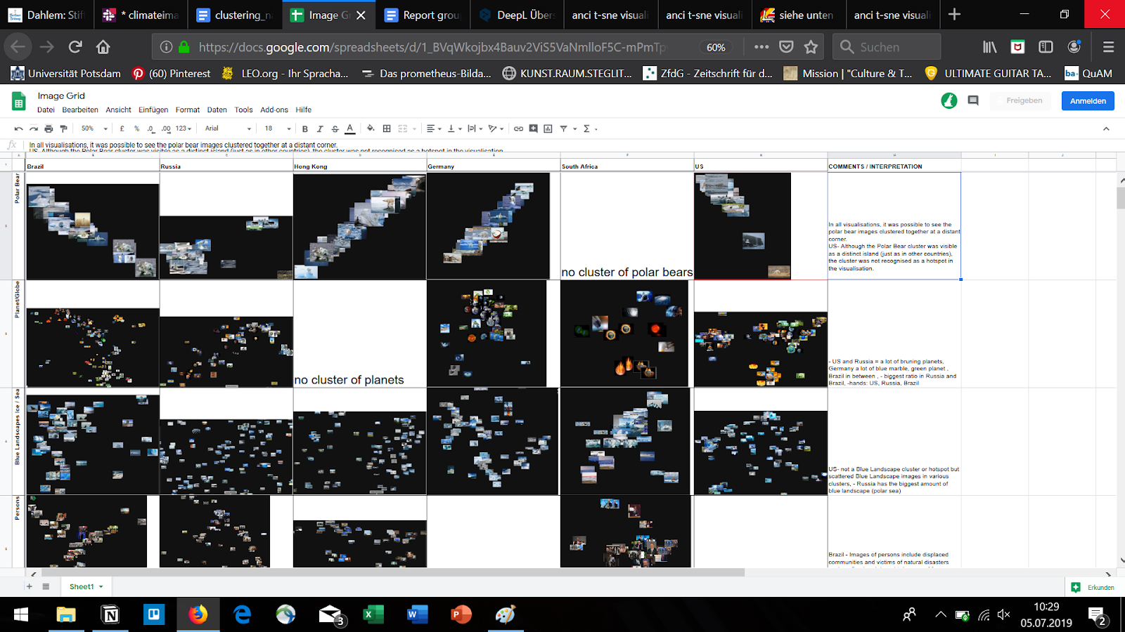
Grid (cutout) with Screenshots of the t-SNE Clustering.
Afterwards we looked for further qualitative annotation tools to analyse the clusters and the images more precise. Because the role of people within the entire t-SNE visualization was distributed or because there was no cluster that gave us all images with people, we manually checked all images to get new qualitative clusters compared to t-SNE. We therefore used the qualitative data analysis software MAXQDA as a digital method. We just started this work. It is rather a project for the future.
Concerning the research focus of the other project group 3 about the “Fridays for Future” movement, we were interested in the images showing people. Based on this, new research questions were formulated: What role do humans play in climate change communication and how can we frame it? Which types of people were shown the most? Politicians, activists, victims or something else? We started to do a detailed analysis of the German images (about 2.000) sampled according the keywords: Climate change, Global warming, Energy transformation, Climate change adaptation, Climate change impacts, Climate change mitigation, Climate change disaster, Climate change risk and Sustainability.
We developed a qualitative code system in MAXQDA that works on several levels and started to annotate all photos that contain humans and significant body parts such as hands (holding the planet). Our code system consisted of the following codes: 1. gender (m, f, mixed, not identifiable), 2 role (causer, victim, activist, politician, not identifiable), 3. Scale (local, distant, not identifiable). These are to be complemented by frame elements (according a.o. to Wardekker, Arjan): 1. problem definition, 2. cause, 3. mitigation, 4. moral effect, 5. threat/prevention, 6. promotion.
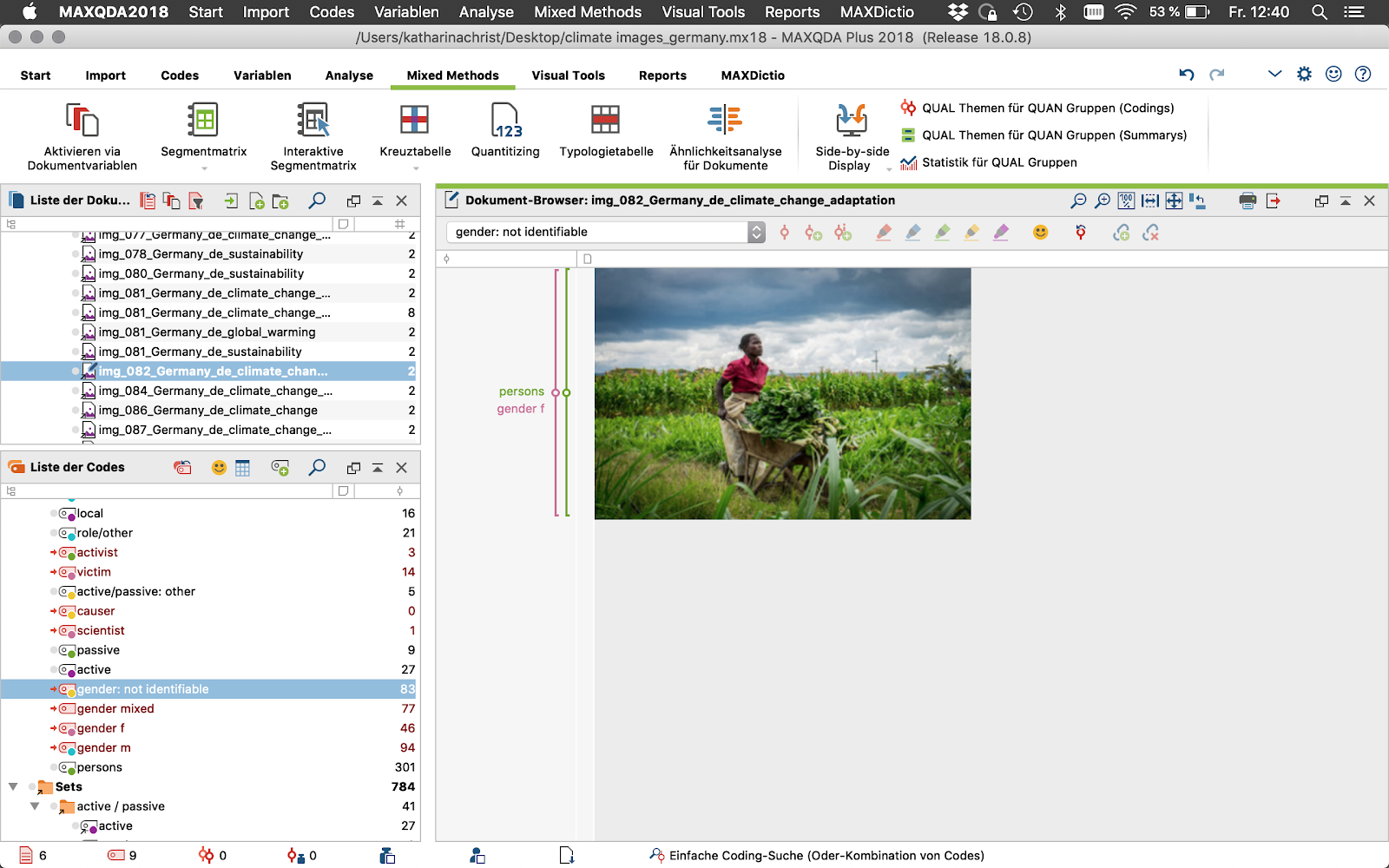
Annotating all images with people in MAXQUDA.
5.4.2 Investigating the code behind t-SNE and the way of clustering
To evaluate the output from the CNN and t-SNE workflow which produced the visualizations (dataset 3), and understand the process (RQ2.6) and why they might make relate to what human annotations (RQ2.7), source code of the process was investigated. The stack has two sides, with data pre-processing pipeline written in Python, and the user interface is web technology JavaScript. The former generates a JSON data structure, which the latter reads to produce the UI. Code is available online on GitHub.
5.4.3 Analysing image metadata: Which image sources were used?
The scraping of the Google search engine result page generated a rich dataset with a large number of metadata fields (dataset 2). The dataset contains the URL of each of the images. By analyzing the websites hosting the original images, we could map the websites that had the most influence on the images that Google users see in their browser when the search for specific climate change related terms.
In many cases, the search results contained multiple URLs that were pointing to the same domain or website, e.g. 4 different images posted by a big environmental NGO. The links, however, often pointed to different sub-sections of a website or simply were formatted in a different way. To consolidate our dataset and identify the sources of the images, we had to trim the URLs and in most cases, only work with the domain names. In some countries, we had to include the subdomain section of the URLs to identify distinct sources of information, e.g. a media outlet or a specific governmental agency. Different top level domains (TLDs) and the countries behind these TLDs follow different practices of allocating domain names, for example, Hong Kong and the United Kingdom both have second-level domain names for commercial companies, government agencies and nonprofits. Hence, we first analyzed the structure of the URLs on a country level bases, and then we trimmed them accordingly.
We worked with the image results connected to a single search term (“climate change”) and analyzed the images from the following five language spheres or countries from five continents: Brazil, Hong Kong, Norway, the United States, and South Africa.
5.5 Findings
5.5.1 The visualization toolkit performs k-means clustering on t-SNE
Upon inspection, we discovered that pix-plot tool used by ANCI also performs k-means clustering in the reduced, two-dimensional space of images. The clustering is done for the purpose of selecting k catch images; for each of the k cluster, the image closest to the cluster centroid is selected. They aim to represent parts of the two-dimensional, reduced image space. Operating in continuous space, t-SNE itself does not cluster in a strict sense ie. it does not place each object in a complete and unambiguous, discrete ontology with definite membership boundaries.
The clustering is done with arbitrary, hardcoded value k=20. The k-means clustering algorithm is guaranteed to find exactly k clusters, given there are at least k objects to classify. 20 might, or might not be reasonable value with any given set of images, depending what one hopes to achieve.5.5.2 Humans do not outright reject the t-SNE visualizations
Human annotators t-SNE surprisingly seem to converge to some extent in the case of the more discrete clusters (RQ2.7). This is significant, since the process of creating t-SNE visualizations from source images extracts no semantic, “cultural” information from dataset 1. We hypothesize that human annotators too consider the salient properties of the images such as their shape, colours, contrast, and composition when they evaluate the visualizations produced by t-SNE, not only their symbolic meaning which is unavailable to the algorithm.
An observation was made that same (perhaps duplicate) image represented more than one of the clusters. This is in itself not surprising, once we read from the source code that the image closest to each cluster centroid is selected.
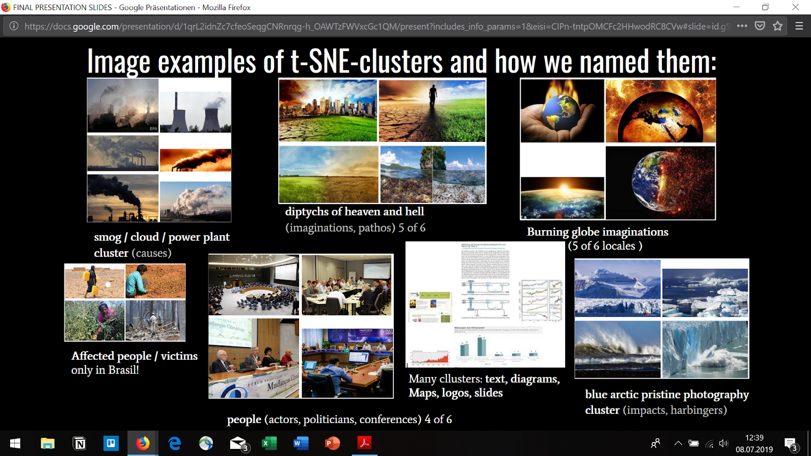
We found a few findings by analyzing the detected t-SNE-clusters:
-
Every locale has several clusters of infographics, brochures, diagrams, book covers, maps (science, logos)
-
4 of 6 locales have a cluster with people (actors, politicians, conferences)
-
4 of 6 locales have a polar bear cluster (impacts, victims)*
-
5 of 6 locales have a planet / globes / burning world cluster (imaginations, pathos)
-
5 of 6 locales have a cluster with diptychs of heaven and hell (imaginations, pathos)
-
Every locale has a blue arctic pristine photography cluster (impacts, harbingers)
-
Every locale has a drought photography cluster (impacts)
-
Every locale has a smog / cloud / power plant cluster (causes)
More general findings in regard to the images:
-
There is an overwhelming amount of (landscape) photographs
-
There is an overwhelming amount of infographics
-
We didn’t find many images of protests and climate impact victims
-
Climate imaginaries are cliché-ridden by “burning worlds”
*There was a small group of polar bears in the US, but t-SNE didn’t choose to cluster them etc. This is also true for other clusters.
The complete analysis of the qualitative annotation with MAXQDA is still pending. So far we could determine a first frequency distribution. Of the 2027 Google images examined, only 14.8 percent contained people as objects. Regarding Google, the focus of image search results in Germany is on diagrams, graphs, etc. as well as mainly landscape photographs showing the destroyed or threatened nature.
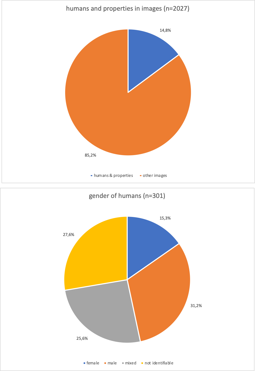
First result annotating with MAXQUDA. Percentage of images with people compared to the rest
5.5.3 Where do images on Google Image Search come from?
To address circulation and mediation of climate change images on Google Image Search (RQ2.1, RQ2.2, RQ2.3, RQ2.4, RQ2.8) we investigated the image source URLs, available in dataset 2. We generated a network-based visualization for the domains and subdomains behind the images about climate change, and we also explored the statistical distributions of source for each country.
To generate the network, we created a node for every image of the complete corpus that we downloaded by following the links on the Google Image search engine results page. The edges of our network map connects the images that were hosted on the same website (domain / domains and subdomain part of a URL).
The network contains the most used sources across the five countries. On this network, we could find multiple images distributed by stock photo agencies, such as Dreamstime or Shutterstock. These results often contained composite images, for example before and after climate catastrophe illustrations. In contrast, government agencies from multiple countries tended to use charts and infographics coming from policy documents.
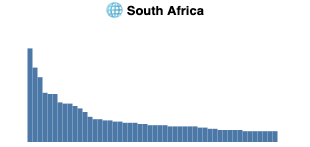
In our exploratory data analysis of the statistical distribution of image sources we discovered that different locales have varying shapes. Formulation and statistical testing of hypotheses was not done, except the distribution perhaps surprisingly does not follow Zipf's law.
Shape of top n=50 most frequent domains appearing in image search in the ANCI dataset per country. Each country has a very long tail, which we truncate at n. Visually, in data from Germany, Hong Kong and USA no sources are considerably more prominent than other sources. In Russia and particularly in South Africa a few competing sources provide an authoritative amount of climate change imagery, with a collection of second tier sources before a dropoff to the tail.


Looking more closely at the image sources, we compared how widely the images coming from one specific website were used across multiple countries. The preliminary results are omitted here, but for example images from the Hong Kong Observatory service, for example, were only part of our Hong Kong dataset, while the images coming from Wikipedia were part of the search engine result pages in multiple countries. Hong Kong Observatory has high locality, whereas Wikipedia has low locality, or alternatively high globality.
Regarding RQ2.8, YouTube, a Google product feeding video cover images to the Google Image Search appears prominently near the top for many of the investigated countries for this data. This is a transmedial observation between video, image and text, namely the search query. Perhaps something ought to be said of the wide range of products Google has, and how they feed to one another as Google cross-subsidies its own services (Srnicek 2016), RQ2.8.
5.6 Discussion
t-SNE is a topological conceptualization of an abstract space of vectorized images, rather than a graphical one. Hence, the usual graphical methods (as seen e.g. in two tool sessions Visualizing Large Image Collections and Network Analysis at DMI19) which define the graphical networks by deriving the concept of the edge from metadata such as cooccurrence or analyzed keywords, rather than from salient properties of the images themselves.
When we are looking at a t-SNE output visualization, the following question is begged: how do these objects cluster? Working with more trick-of-the-trade digital methods, such as social network analysis (SNA) or other graph-based data, we are used to performing community detection using tools we trust and which have acceptable and familiar results, such as the so-called “Louvain method” (Blondel, Guillaume, Lambiotte and Lefebvre 2008) implemented by Gephi’s modularity detection. The modularity algorithm we are most familiar with is guaranteed to allocate each node to exactly one of the inferred communities. This is in many ways convenient (e.g. for mapping the communities to discrete colours), but at node-level does not match what is known about real world phenomena of interest to digital methods scholars.
Working against the method, manually and carefully deciding on community boundaries in graphs is a useful exercise. With t-SNE it is a necessity, lacking an automated method. As was apparent in the qualitative clustering we performed, some boundaries are easy to draw, but the task quickly becomes difficult. We did not have a criteria for “k”, or for proximity other than what we visually interpreted. What if the objects were contrast-normalized? What if the black background color was something else? What if their sizes were different? What if they were not photographs? What if we didn’t have the catch images available for us? Decision-making situations like boundary finding and manual clustering put our training, theoretical knowledge and interpretative capacities to good use.
It seems that the spatial (ie. not the clustered) t-SNE layout maps onto human interpretations at least partially, and interestingly ("the document cluster", "the dataviz cluster", "the book club", "the polar bear cluster", "the burning globe"), though various cognitive biases (priming, confirmation bias, accessibility bias) of the human annotators ought to be controlled for, or studied for their own sake.
As we have seen, the term “clustering” can be slightly confusing. The fact that our tooling does k-means clustering to select the catch images adds to the confusion, which we would do well to ignore. Running k-means clustering with any arbitrary k on a t-SNE reduced manifold is easy to justify – why not k=2 or k=200000? The algorithm will find exactly than many clusters for us. It is best to think of them as k catch images rather than k clusters.
To afford further use of the clustering results, we modified the pix-plot code to store the clustering analysis which the tool discards, and have submitted a pull request which implements this feature upstream to Yale University Library Digital Humanities Lab.
t-SNE is a challenging and productive tool for exploring large image data sets. It is an alternative to keyword-driven image research, because the clusters do not come with terms - although we produced our corpus by using keywords. It helps to find framings and to explore images. It changes the epistemic practice profoundly.
On the level of the question of how the search queries for images of climate change differ in different regions and language areas, the following points need to be discussed further:
If we interpret the clusters that t-SNE has formed for the various locales, climate communication with images worldwide appears to be quite standardized. It was conspicuous how many similar and identical images are displayed by Google in each locale. In addition, the images listed first were often marked by large clichés. But it was also noticeable how few image types dominate the subject, formerly those of large image agencies. Some of these, in turn, were not the images that we ourselves have in mind on the subject of climate change. Each locale has similar clusters to polar bears, polar regions or people at conferences. If the framing approach to climate images was particularly appropriate here, one can ask how and why t-SNE arranges the images according to this typology, when the clusters are formed according to a completely different logic than those of the framing approach. While cluster formation is based on machine learning, the CLusters are based on a lengthy qualitative interpretation. This shows how we found out more about the functioning of the Google algorithms through our methodical approach and the use of Google as an access to the universe of climate images than about our topic - culturally different images of the climate.
5.7 Conclusion
t-SNE is a challenging and productive method for exploring large image data sets:
-
An alternative to graphs-based layout methods – no human defined edges, c.f. Visualizing collection of images and Visual Network Analysis tutorials with Gephi this week.
-
An alternative to keyword-driven image research – clusters do emerge via language (although we produced our corpus by using keywords)
-
Helps find framings and explore images per se – changes the epistemic practice profoundly.
-
Is not a completely bonkers thing to try – aligns with human interpretation.
Regarding t-SNE, we might recommend being explicit about language use for clarity and avoiding confusion, and not call the visual “clusters” in the t-SNE something else.
There is reason to reconsider k=20, and maybe doing so in a process which qualitative methods and computational methods converge. Or alternatively diverge toward establishing and maintaining tension. An implication for design: It might be a good idea to place the selected catch images in the primary image space rather than in the sidebar.
Ideas for future research:
-
Construct average images in the style of Francis Galton of clusters.
-
Analyze the media archeology of t-SNE in the history of AI.
-
Analyze the concept of frontispiece (image placement on the page) in the Google Image Search algorithms, relevant contents, networked images, landing pages, freshness and authority, high quality, uniqueness, descriptive file names, delete duplicates. → What is the reality of Google search?
-
Analyse the colors in relation to google ranking. Uniqueness? Globes?
-
Work more on Gephi with network analysis of URLs.
-
Analyze how Google image search ranks images and relate this to the question
6: Climate emergency and the new climate movements
6.1 Dataset creation
6.1.1 Instagram
-
We have used the DMI Instagram Scraper to collect the most recent 100 posts each for each of the hashtags #fridaysforfuture, #extinctionrebellion, #climatechange, #climatecrisis, #climateemergency. We limited our search to 100 posts since the tool failed for larger searches (too many searches at the same time getting blocked by Instagram).
-
We have also used the DMI Instagram scraper to collect all the posts sent by the following users: @extinctionrebellion, @fridaysforfuture, and @gretathunberg (we thought that these were the most significant accounts in terms of “anti-program” call to action about the environmental catastrophe). Since the quantity of these accounts’ posts was limited we decided to include all of them in the sample. At the time of analysis, Extinction Rebellion, Fridays For Future and Greta Thunberg accounts had respectively 423, 58 and 316 posts.
-
Furthermore, we have teased out the Top 10 most liked Instagram images for each of these accounts @extinctionrebellion,@fridaysforfuture, and @gretathunberg.
6.1.2 Twitter
-
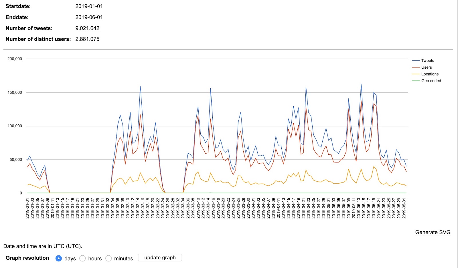
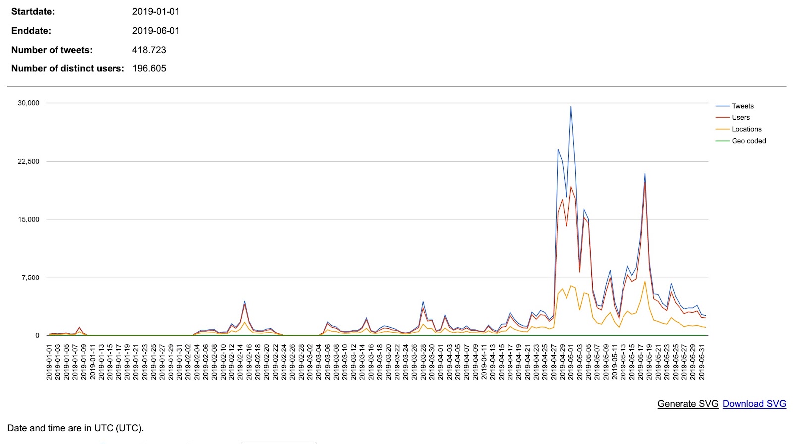
We focused on data from January - May 2019 in the TCAT ‘globalwarming’ dataset, as this has contained the most activity from the new climate movements. However, the reduced Twitter bin still contained over 20 million tweets and was too large to easily work with. So we created two smaller subsets based on queries of the main ‘globalwarming’ dataset: tweets containing “climate change” (9 021 462 tweets) and “climate emergency” (418 723 tweets).
-
We downloaded the frequency chart for each term to identify any spikes in Twitter activity, and were also able to identify any server outages that had affected historic tweet collection (seen through a flatline on the chart at zero).
-
We then used the ‘Tweet statistics and activity metrics’ >> ‘Media frequency’ option in TCAT to extract a list of media URLs from the subsets. This provides a 3-column output: ‘interval’ (the date), ‘media url’, ‘frequency’ (the number of times the URL appears in the dataset).
6.1.3 Facebook
We used Netvizz page posts module to collect the most recent 100 posts sent by @extinctionrebellion, @fridaysforfuture.org, and @gretathunbergsweden. It is not possible to use Netvizz to search for hashtags or keywords in the same way as we did for Instagram or Twitter.
6.1.4 Tumblr
We worked with Tumblr Tool to extract the most recent posts through tag-based queries for #climate change (1000 posts between July and June 2019), #climate crisis (1000 posts between July 2019 and October 2018), #climate emergency (137 posts between July 2019 and October 2018). We opted for max. 50 iterations (1 iteration = 20 posts), which gives us an idea about the frequency of hashtag use over time (the more ‘popular’ a hashtag the shorter the date range of the specific query output –> e.g. “climate change” can be considered the most dominant term with a high frequency of use while “climate emergency” seems to provide us with a concept that is still fighting for social media attention (at least on Tumblr). For #fridaysforfuture (758 posts), and #extinctionrebellion (420 posts) we used the same option, which gave us data in the period between July 2019 and November 2018.
6.2 Methodology
6.2.1 Text analysis
-
For the Instagram and Facebook posts collected by hashtags, we used Tagcrowd to generate lists of the Top 50 most frequently mentioned words in Instagram posts by hashtags. The first attempts of creating word clouds revealed that there were multiple languages in our dataset, therefore we added stopword lists for German, English, French, Spanish, Italian, and Swedish to the tool.
-
For the posts collected by accounts, we have used a Python script to generate lists of the Top 50 most frequently mentioned words in those accounts’ posts captions and then we managed to clean the data from undesired words (f.i. words that weren’t included in the Stop Words lists). Then we have reduced these most frequently mentioned words from 50 to 20 in order to perform a better analysis. Moreover, we selected a few words that we considered meaningful that weren’t included in the Top 20 lists.
-
Cross-platform text analysis was performed by extracting the most frequent words on each platform using Tagcrowd. While doing this, we ran into the problem that the collections contained multiple languages and we needed to add several lists of stopwords. We have explored the languages for Facebook and Instagram, adding the formula =detectlanguage() in the Google Sheet, relying on Google Translate engine for identifying the language of each post.
-
While selecting the top frequent words, we came across certain problems with data cleaning. Tag Crowd tool does not have a built-in stopword list and other possible irrelevant textual data such as URL parts. We had to clean them manually on .csv files.
6.2.2 Image analysis
-
To analyse the images, we used the Density Design Image tagging tool interface, which uses the Clarifiai API to tag images according to what the API “sees” in the image. We prepared the input csv file for Clarifai, which contains only the single column of the image URLs copied from the output files from Instagram Scraper, TCAT and Netvizz. This csv is then uploaded to the tagging interface, selecting ‘General’.. The output is a 3 column csv file containing ‘image url’, ‘concept’ (i.e. the tag given to something seen in the image), and a confidence score that the API applies to the tag.
-
This worked correctly for Twitter and Facebook, but the interface did not recognise the URLs obtained from Instagram. We discovered that this was a bug related to working in Google Sheets. To workaround the bug, we opened the input .csv file in Excel, confirmed the cell format as ‘General’, then exported as a new csv file. This new csv file was recognised correctly by the tagging interface.
-
We uploaded each csv output to Table2Net to create a bi-partite network, with nodes representing image URLs and image tags. This produces a .gdf output file which can be used to create network graphs in Gephi.
-
To analyse Tumblr images, we applied different techniques:
a). To work with data retrieved through #climate crisis, #climate change and #climate emergency queries, we chose an approach focusing on co-tag relations: For this purpose we created a combined cotag-network (only for posts with visual content) to identify the main divergent and overlapping issues for #climate change (507 posts), #climate crisis (365 posts), and #climate emergency (68 posts). To do so, we filtered our data in Google Sheets (by combining 3 input files and removing the duplicates), which gave us an output of 887 unique posts and a .csv file to upload in Table2Net. The resulting .gdf file was analysed in Gephi (by running “modularity class”) with the aim of identifying the main clusters in the issue space (the network was analysed by freezing the main three nodes and letting co-tags spatialize through ForceAtlas2). To identify patterns of imitation in the visuality of these clusters, we ran the images through ImageSorter (downloaded separately for #climate change, #climate crisis, and #climate emergency). The results of this exercise (co-tag issue spaces and visual patterns of imitation) were used for cross-reading with and analysing the visuality of the protest movements.
b). To address the specifics and mutual references in the visuality of #extinctionrebellion and #fridaysforfuture, we created a combined image-hashtag network. To do so, we first filtered out all posts containing images in Google Sheets (479 #fridaysforfuture images after removing 39 broken links and 421 #extinctionrebellion images after removing 22 broken links). In the second step we combined two sheets and removed all duplicates (from the total of 900 posts 809 remained). In the third step, we downloaded the images using the Waterfox extension DownThemAll, which gives each image a numerical identification (001-809). In the combined sheet we then added a column ImageFile with the correspondent image numbers and uploaded the .csv file to Table2Net with a result of a bi-partite network (images and hashtags as nodes). This finally provided us with a .gdf output to spatialise and analyse in Gephi.
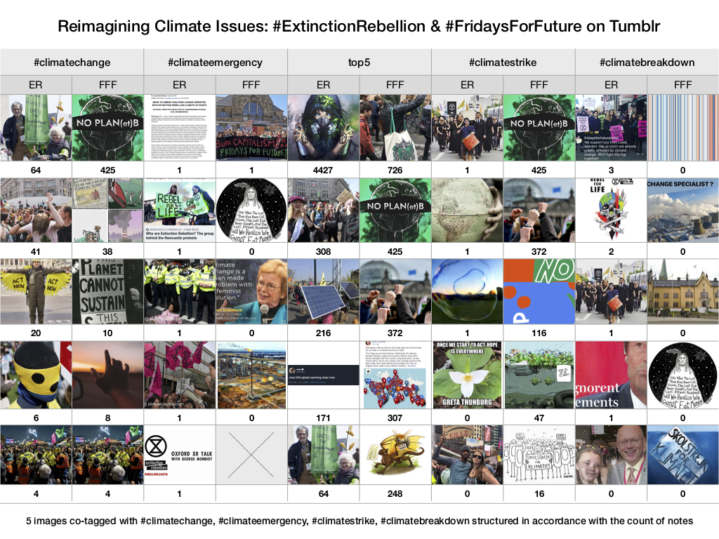
c). Drawing from the specifics of the network, we then worked with four selected co-tag relations to identify visual traces of climate issues as they were reimagined by the protest movements. To do so, we filtered the “hashtag” column in Google sheets for “climatechange”, “climatestrike”, “climateemergency” and “climatebreakdown” and restructured the results by the count of notes. To load visual content, the =IMAGE(xy) formula was used. The outcomes of 5 images per cotag for #extinctionrebellion and #fridaysforfuture respectively were used as an input into a Keynote spreadsheet to create the final visualisation.
6.2.3 Emoji analysis
-
Data collected from DMI Instagram Scraper, DMI-TCAT, Netvizz and Tumblr tool was analysed using the Text Analysis tool (http://labs.polsys.net/tools/textanalysis/) to understand the use of Emojis for various keywords ( Climate Crisis, Climate Emergency, Climate Change & FridaysForFuture) across the social media platforms.
-
To obtain a manageable Twitter dataset, we used the “Tweet Export” >> “Random set of tweets from selection” function, providing 1000 random posts from the 1st Jan 2019 to 1st June 2019. For the other three platforms (Instagram, Tumblr and Facebook) the 100 most recent posts were used because the scraping tool limited us to a small number.
-
To further contextualise the image-hashtag network for #fridaysforfuture and #extinctionrebellion on Tumblr we used the column captions from each dataset as an input into the TextAnalysis Tool.
6.2.4 Domain analysis
We have teased out the Top 10 most liked, most shared and most commented FB posts for each of these accounts: @extinctionrebellion and @fridaysforfuture.
Tumblr
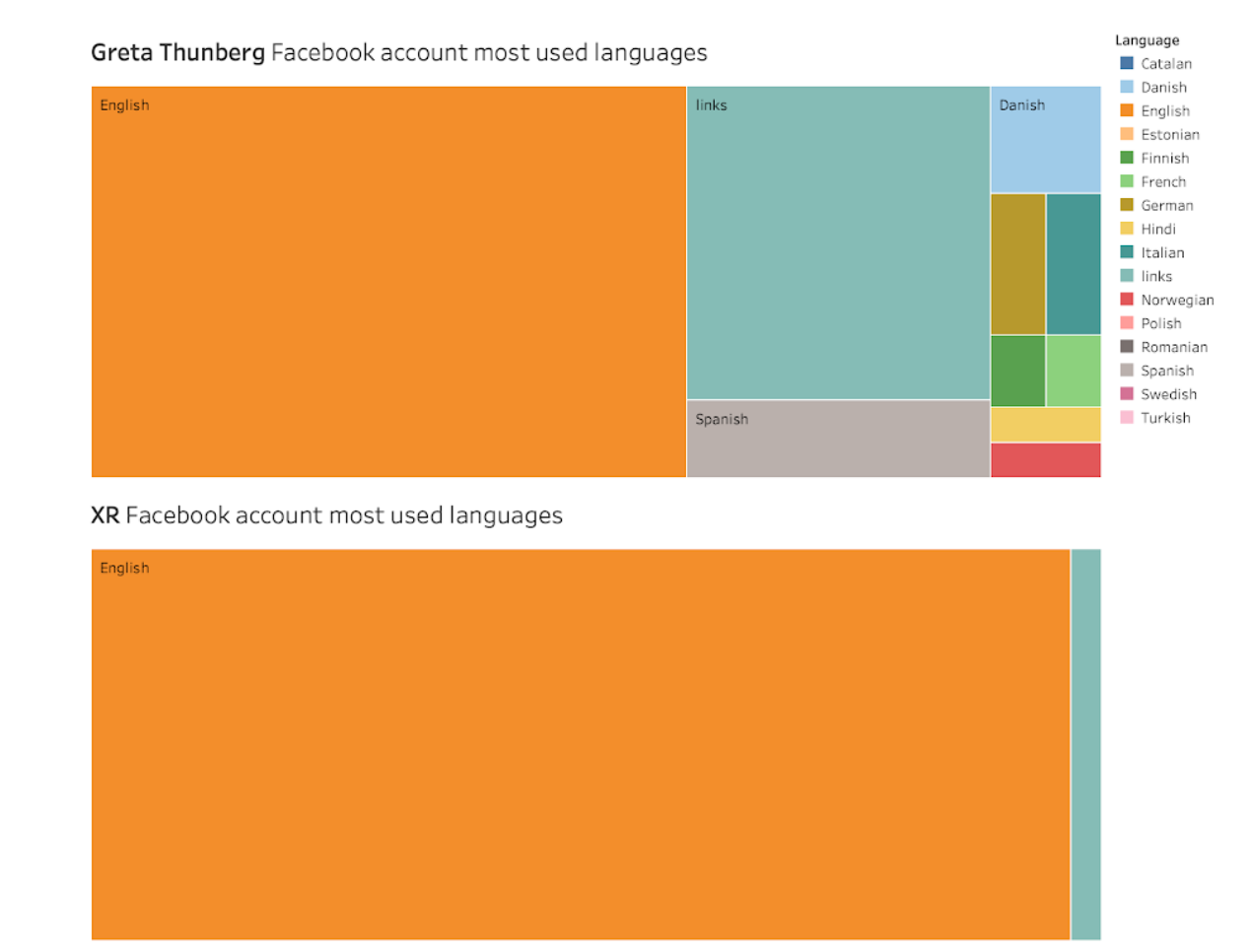
To provide more context to the particularities of climate-related image circulation on Tumblr, we worked with the “source_title” column in Google sheets. By using Pivot tables, we ranked all external image sources in accordance with the frequency of their appearance in two combined datasets (1. #climate change + #climate emergency + #climate crisis 2. fridaysforfuture + #extinctionrebellion). The resulting tabular files were used as an input into Raw Graphs (circle packing) to create two hierarchically structured visualisations (see here and here).
6.2.5 Metrics analysis
We have used DMI Compare Lists tool for comparison. We have worked on the domain URLs retrieved from Facebook instead of full URLs in order to picture citation commonalities across platforms. Since the tool does not allow for comparison of more than 2 lists we have run it for multiple times to find cross-citation between XR, FFF, GT pages. Although more online outlets appeared in different analyses, we have reported in the findings section the most common ones across the three pages.
6.3 Findings
6.3.1 Instagram
Account biographies:
We noticed that both Fridays For Future and Greta Thunberg accounts seem strictly related because the 20 most frequently used words almost coincide exactly. In fact, FFF Instagram account appears to be reposting many posts coming from Greta’s account. Her profile has 316 posts, while FFF account has posted only 58 times. This low number of posts can be explained by the fact that local groups are creating Fridays For Future accounts for specific geographic areas (regions, cities, etc.), likely to actively engage more citizens, and this reflects in fewer posts for every account related to the protest movement. On the other hand, there is also a substantial difference in the followers base: only 53k for the main/global Fridays For Future account and 2.2m people follows Greta’s page.
While FFF and Greta’s accounts appear to be more focused on promoting school strikes and thus referring to a younger population (#schoolstrike4climate has been mentioned 120 times from both account separately), Extinction Rebellion account seems to ask more directly for a governmental action and most likely refers to a more adult portion of the population.
Hashtag publics:
TEXTFor what concerns the 100 most recent posts for the analyzed hashtags, the most straightforward observation is that when people mention #extinctionrebellion they sometimes also mention #fridaysforfuture , but this tendency is not found the other way around. In addition, observing the 20 most frequently used words related to these hashtags, when people use #extinctionrebellion they tend to mention more the concepts of climate change, climate emergency and climate crisis. Vice versa, those using #fridaysforfuture tend to focus mainly on the climate change concept, beyond the strikes and Greta Thunberg obviously.
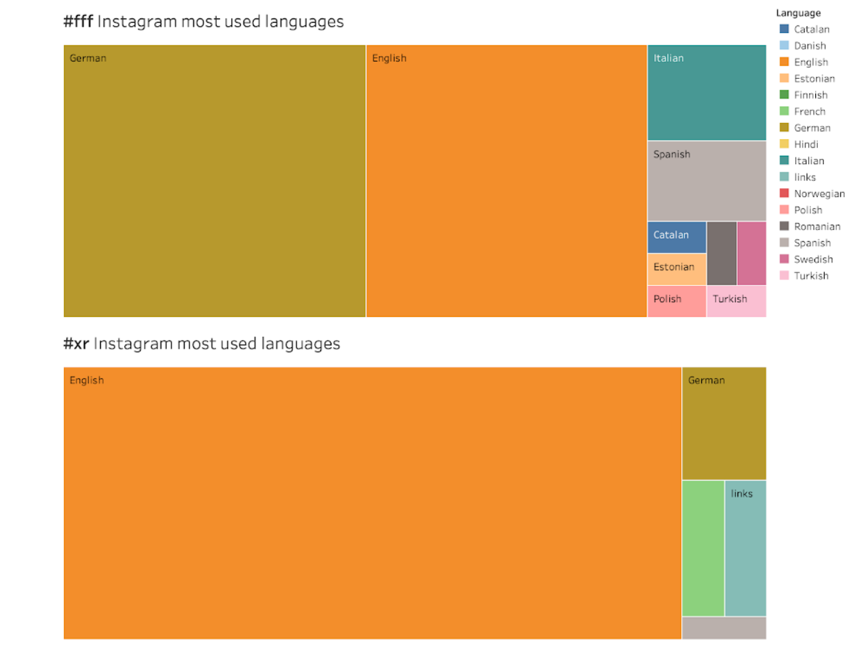
Considering the language analysis of these most used words for the selected hashtags, the most striking finding is that for #fridaysforfuture there are two most used languages, German (43%) and English (40%), whereas for #extinctionrebellion English is the most used language, with 88% of the post descriptions.
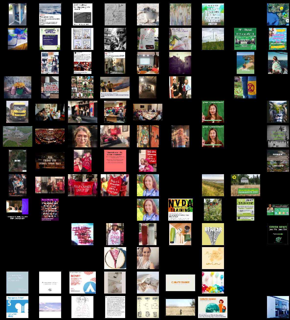
We noticed that the Top10 most-liked images on FFF and ER Instagram accounts are protest images with crowds of people holding various kinds of banners and signs.
IMAGELooking at the tag network for #fridaysforfuture on Instagram, we observed two prominent nodes for ‘people’ and ‘business’, as well as a smaller node for ‘no person’ at the bottom left of the network:
We also checked images that had been labeled as ‘business’. We found that most images are actually protest slogans, signs and banners. For example, a photo of a schoolgirl holding a protest sign was tagged by Clarifai as ‘business’.
We also used Image Sorter to sort images by colour, and perform a visual analysis of #climateemergency on Instagram, which helped show the dominance of protest imagery and a significant number of people:
6.3.2 Twitter
Hashtag publics:
We compared the tweet frequency on the hashtags/keywords for climate change and climate emergency. Climate change showed a steady pattern of peaks and troughs, whereas climate emergency is shown to explode onto Twitter around May 1st, the date when the UK Parliament declared a climate emergency. As noted above, the volume of tweets for climate change is around 18x higher than for climate emergency, so the y-axis scales are different in the graphs below.
Climate change tweet frequency chart by day:
Climate emergency tweet frequency chart by day:
We then created networks in Gephi to analyse the clustering of concepts/tags within images posted to Twitter. Here, we focus on the network from ‘climate emergency’
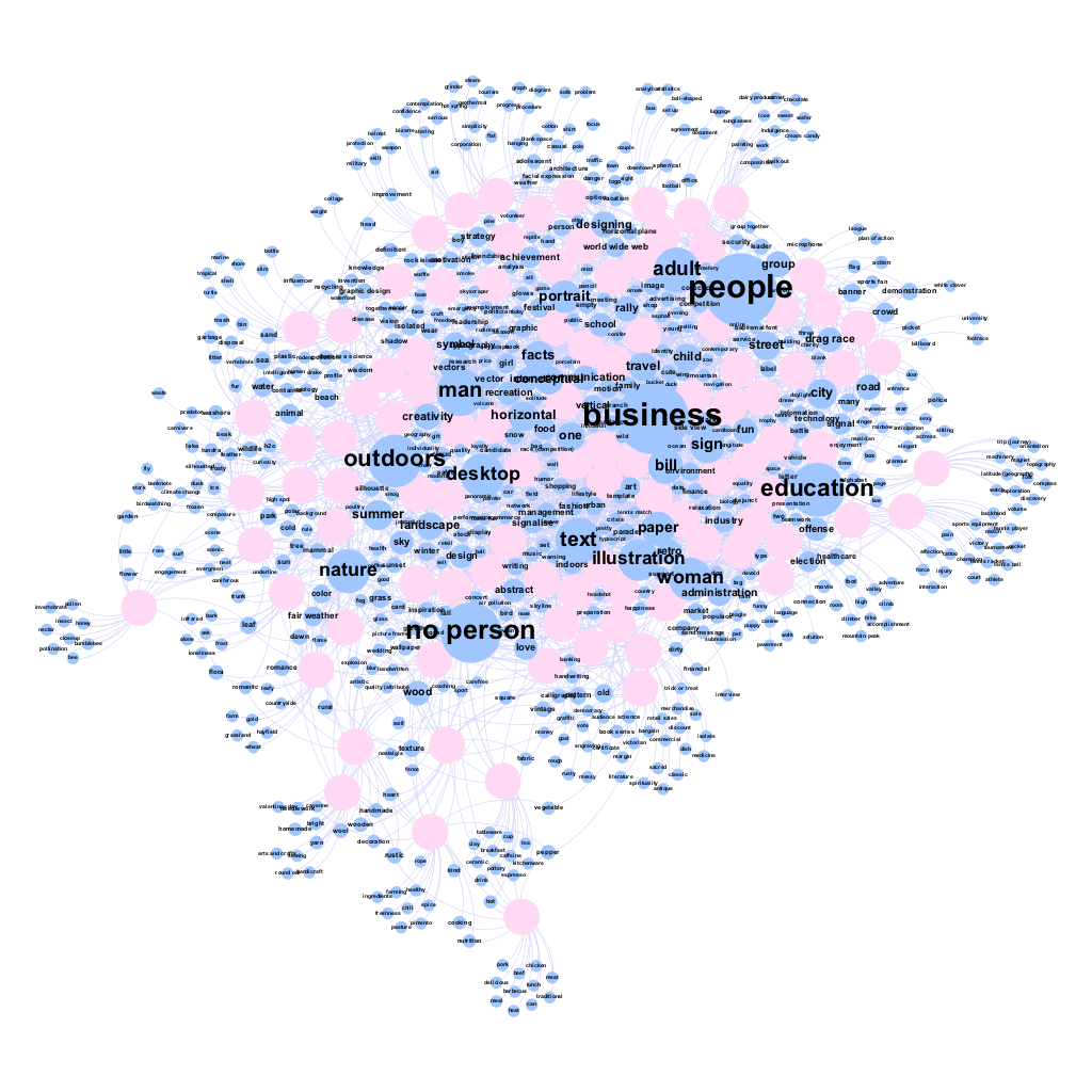
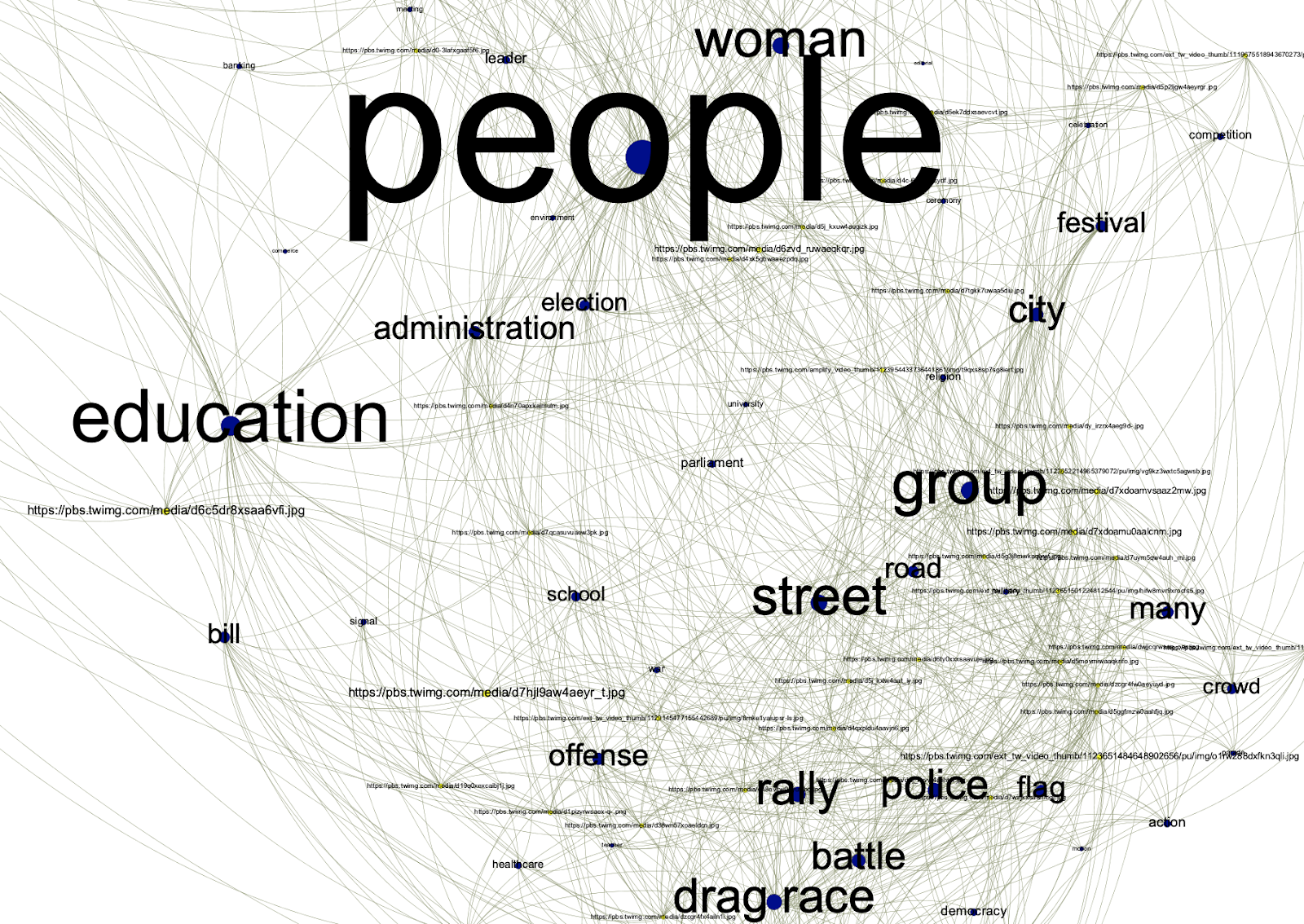
In contrast to Google images for ‘climate change’ we can see a dominant central node for ‘people’, and a much smaller node for ‘no person’ near the top of the network.
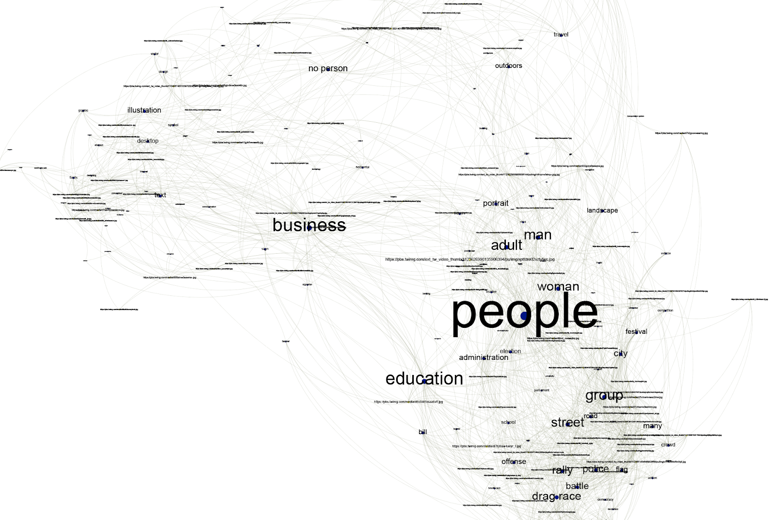
Zooming in on Cluster 1, we see some self-explanatory labels near ‘people’: street, police, crowd, city all suggest urban direct action protests of the kind that were staged by Extinction Rebellion and contributed to the development of ‘climate emergency’ as a phrase. Also notable here is the tag ‘drag race’ which, as we saw in the Google results, actually corresponds to protest banners:
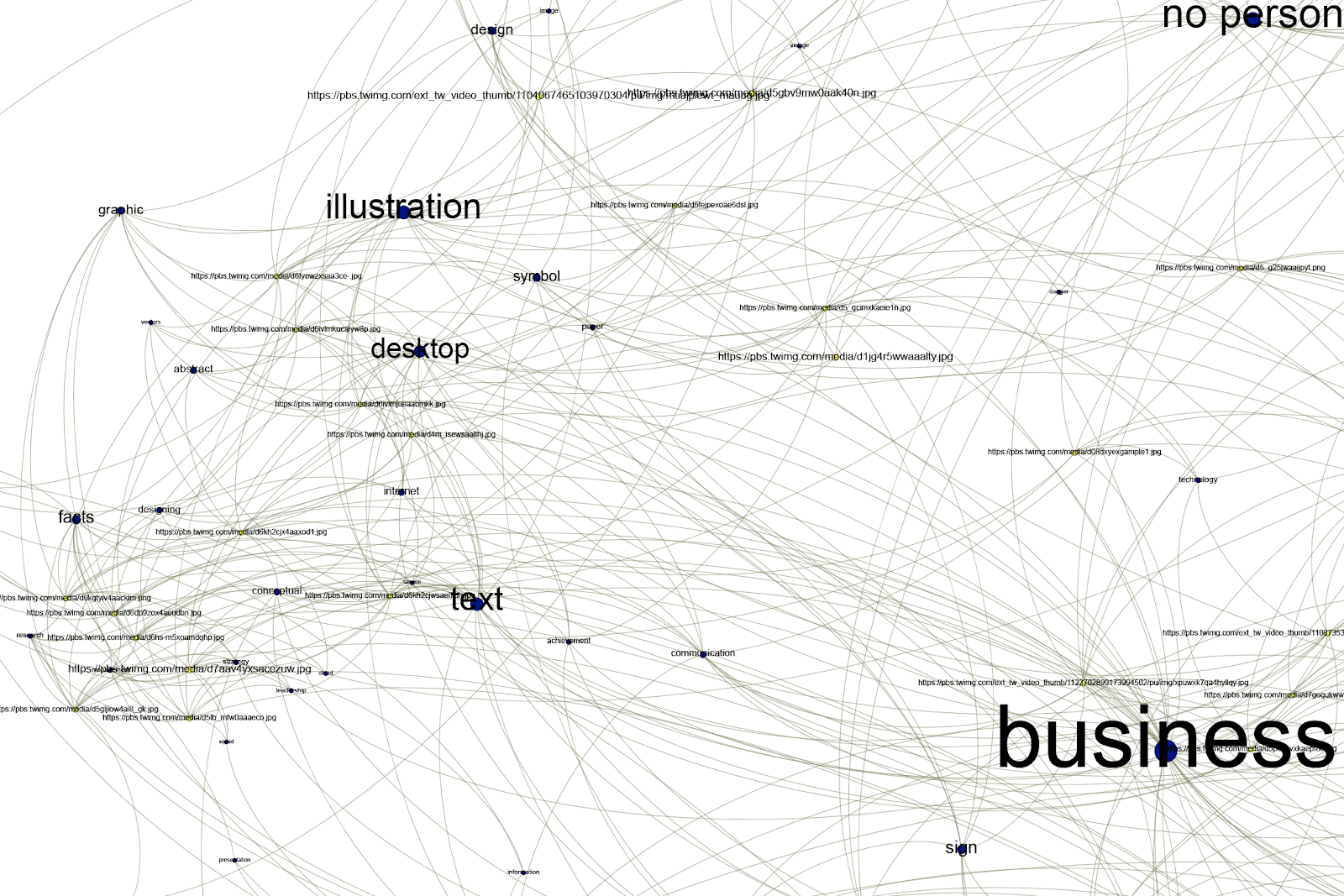
Zooming in on Cluster 2, we see tags related to more familiar types of climate change imagery, around text, illustrations, graphics and facts. This cluster is recognisable from the Google results but far less prominent. We can also see the prominent ‘business’ label which sits between Cluster 1 and Cluster 2. As we saw in the Google results, ‘business’ seems to relate to signs and logos, so is indeed linked both to the protest banners in Cluster 1 and the charts and illustrations in Cluster 2:
Overall, the network suggests that climate emergency on Twitter has a different visual vernacular to the ‘mainstream’ climate images found on Google. Clustering the labels together helps to indicate the meaning of the labels, and provide clues for labels which do not have self-evident meaning (such as ‘drag race’ and ‘business’).
6.3.3 Facebook
Post Word Frequency Findings
-
Analyzed dataset of top 50 words for each of the three activist groups does not predict significant collaboration across the groups in terms of common discourse. While several common words appear among the high ranking words (such as global, change, world, climate, people, future) they are negligible since they do not demonstrate a discursive uniformity.
-
Apart from the commonly appearing words in each group’s posts, the differing words in the top frequent 50 lists include capitalism, attacks for Greta Thunberg FB page; action words such as march, watch, strike for Fridays for Future FB page, mammals, threatened, biodiversity for the Extinction Rebellion page.
Facebook Co-domain Analysis
The analysis yields that the most commonly domains shared in the sample Facebook posts include theguardian.com, facebook.com and youtube.com. The findings gives us a sense of the most commonly cited online information outlets across the three activist groups.
6.3.4 Tumblr
Analysis:
In the combined co-tag network of 887 Tumblr images shared with #climate crisis, #climate change, and #climate emergency, the term “climate change” is dominant and most densely connected with the cluster “environmental issues and politics”. It also shares the main tags in the cluster “environment, nature and global warming” with the term “climate crisis”, the second influential term in the network.
Visually, the “climate change” space on Tumblr (see vis here) is dominated by high-quality images of disturbed nature (the blue and grey of the melting ice, e.g.,most recently, in Greenland, the yellow and red of the deserts and forest fires) coming from external (and rather mainstream) sources such as The Guardian, The New York Times, BBC, CNN, etc (see vis here). Contrasted by the images of activists, politicians and other commentators, this visuality suggests a resonance in the perception of climate change: demanding urgent action vs. justifying, explaining and addressing. The “climate crisis” space shares the same visual patterns (see vis here), with the notable exception of introducing screenshots, #gretathunberg related art and nature illustrations as a means of commentary and critique directed against the climate change denial.
The cluster “climate activism and protest movements” in the middle of the network, although comparably small, is connected to all three query terms, including the alternative expression “climate emergency”. Important about this cluster is also that it introduces new terms such as #climate breakdown and hashtag-based calls for action (#climate action, #climate protest, #climate strike). The third, alternative, term “climate emergency” has a temporally specific relevance in the context of Canada’s recent political debates. Related to Prime Minister Trudeau’s decision to approve major oil pipeline after declaring a national “climate emergency”, its visuality (see vis here) is dominated by images of Canadian politicians and protesting climate activists.
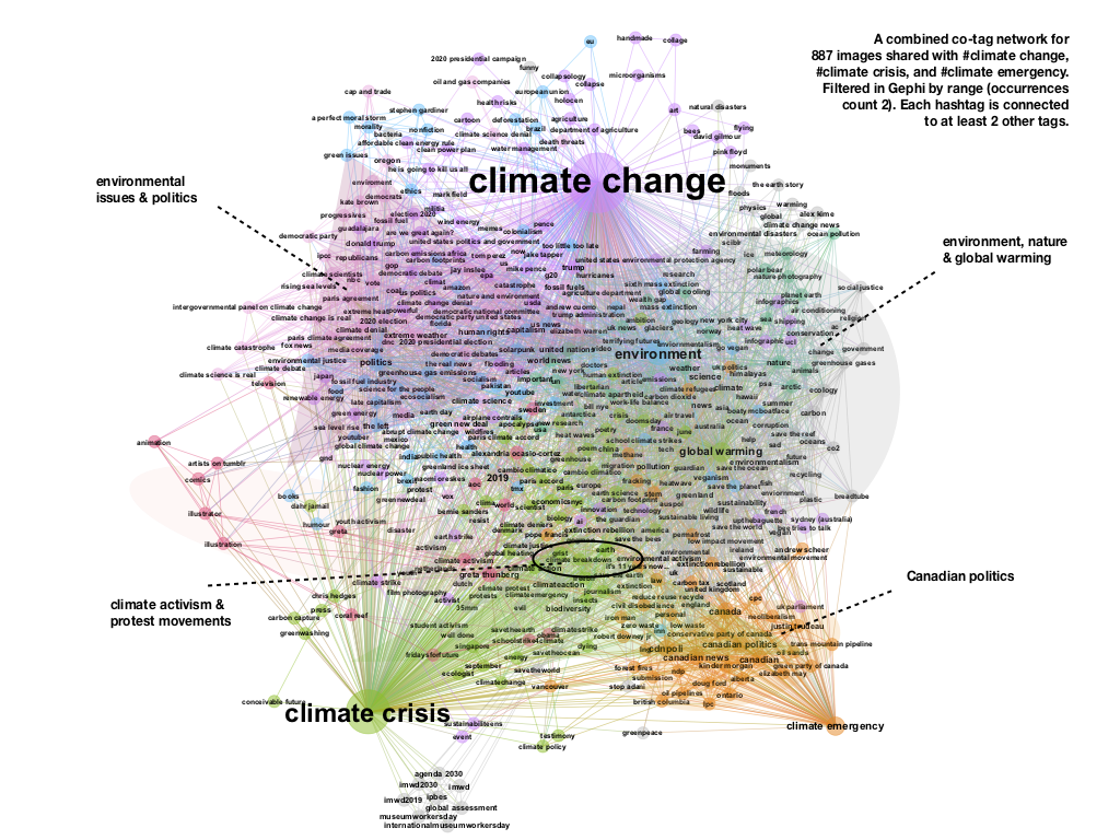
Compared to the historical perspective of Google images, the positioning of #climate change, #climate crisis and #climate emergency in the social media ecology of Tumblr provides us with a continuation of the tendency to use stylized mainstream imagery for purposes of climate change discussion/explanation and political instrumentalization. The intermingling of this tendency with the activist demands for #climatestrike and action is connected to the temporality of data focusing on the most recent events and introducing the shift in terminology from “change” to “crisis” to “emergency” to “breakdown”.
Based on these findings, in the second step, we worked with a combined hashtag-image network for #extinctionrebellion and #fridaysforfuture. Our main focus here was to explore how the above-mentioned terms are situated in the visual cross-references and tagging practices of climate activists.
In the combined image-hashtag network of #FFF and #ER, the climate issue space is roughly divided in two intermingling co-tag areas around #climatechange and #climatestrike (see vis here). At the same time, the overlaps in how #FFF and #ER publics relate within these spaces through images are differently weighted and offer us interesting insights into the resonances in the movements’ positioning and stance.
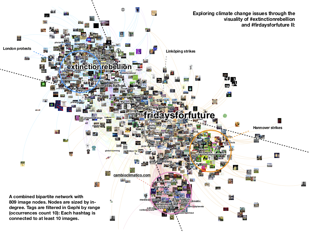
- Not very different from Instagram, Tumblr’s issue publics around #ER tend to prefer addressing the notion of #climatechange in relation to #climateemergency, #protest, #rebelforlife and #tellthetruth.
- The visual co-tag space of #FFF, which is also related to #climatechange, shifts attention towards #climatestrike projects such as #schoolstrike4climate related to the figure of #gretathunberg.
- The terminology of #climatecrisis, though present in the network, is less common. Appearing only in 8 posts in relation to #extinction rebellion hashtags, it is clearly outbid by combinations of alternative expressions such as “climatechangeisreal”, “noplanetb”, and “climateaction”. Another interesting insight is the appearance of the notion of “climatebreakdown” in the center of the network, suggesting a new and thus not yet visible (in terms of metrics) positioning effort in Tumblr’s climate issue space. Remarkable about this notion is that it is shared by both movements to emphasize the urgency of the situation (see vis here).
- Another particularity of the network is its temporal focus on three protests: a series of attention grabbing acts in London (connected to #extinctionrebellion in April-May 2019), school strikes in Hannover (connected to #fridaysforfuture and Greta-movement in May 2019) and small climate activist actions in Linköping (documented by the same blog in the period between November 2018 and July 2019). Different in their size and stance, these protests are characterized by a distinctive visual presence focusing on photo-based documentation of the protest (Linköping), colorful cartoon-like imagery of Hanover school strikes and more aggressive eco-warrior visuality of #extinctionrebellion (combining photos of people literally performing protests in London (wearing costumes, etc.) with stylized visuality of hourglasses and skulls).
- A further finding is related to external image sources (see vis here). Video content from Instagram is not appearing in the network because of the Instagram-specific video URL bug (clicking on the link returns “URL signature expired” when loaded). After checking the posts manually (23 videos #extinctionrebellion and 17 videos #fridaysforfuture), we found that this type of content is mainly used for purposes of sharing relevant (or controversial) protest action moments (e.g. “peaceful climate activists are sprayed with tear gas”), thus offering a valuable insight into the affective charge and the social media ‘presencing’ of the events.
- A look into the use of emojis (see vis here) by both movements gives us further insights into the issue-related shift from debate to action. Among obvious references to the globe, the bees, the trees, and the black sun, the right arrow ➡, for instance, is quite common to emphasize what can be done: E.g., “So what else can you do? Here are a few things ➡Reduce your own carbon footprint by wasting less, eating less red meat and switching to renewable energy where possible. ➡Talk to your friends, collegues and family about climate change...” The use of the cross mark button ❎ is another (language specific) option frequently appearing in the context of #fridaysforfuture strikes in Hannover (suggests a call to action (be there!) or (❎❎❎ 3 days left before the strike).
- Last but not least: A distinct image-tag sphere with weirdly photoshopped nature-related imagery could be identified in the right corner of the network. Uploaded by a semi-automated Tumblr account sharing links to Instagram (with the help of autogramtags, automatic matching of hashtags, and Tumblr’s queue function), it mentions popular tags such as #greenpeace, #wwf, #gretathunberg, and #fridaysforfuturecomes to redirect attention to a private Spanish website cambioclimatic.com asking for donations.
To sum things up: The most interesting finding coming from these explorations is related to the importance of working with the visual co-tag relations as indicators of shifts in relations of relevance around particular issues. This gives us a situated view on the issue in question which goes beyond the logic of social media engagement metrics (dealing only with the most liked, shared and commented content). By paying attention to how tags and images work in relation to other tags and images (see vis here), this approach allows for an alternative view on the patterns of repetition and variation in the familiar visuality of climate change.
This can also help us with the explorations of how the communicative tactics of climate movements are shaped by the appropriation of the very same visuality and language: Co-tagging can be seen as a means of shifting attention from old to new concepts through word play (from savetheearth to noplanetb, from climate emergency to climate breakdown) while the images of the globe produce recognisable alterations that make sense in new ways depending on the stance of the image and its context (digital art illustrations appearing next to analog protest signs).
Across platforms: Specific issues/solutions are not visible, abstract/generic terms, emotional appeal
6.4 Cross Platform Emoji Analysis - Key Observations:
-
Climate Emergency hashtag on Instagram had the most number of Emojis but none on Tumblr.
-
Instagram posts had more Emojis as compared to the other platforms, Facebook posts had the least number of Emojis.
-
The heart & globe emoji were commonly used on Instagram with all keywords. Use of Emojis on other platforms were found to be very random.
6.5 Cross-platform text analysis findings
On most platforms, the most frequent words in the analysed posts were about climate change and activism more generally, rather than specific issues. As expected, the terms climatecrisis and climateemergency are closer to each other and to the activist accounts than the more generic and broad term climate change (although the activists all still use this term). The most distinct difference between the #climatechange, #climateemergency and #climatecrisis hashtags was visible on tumblr. On Instagram, people that used #extinctionrebellion also used #fridaysforfuture frequently, however, this was not the case the other way around. An interesting difference between Fridays For Future and Extinction Rebellion was the use of languages, with FFF being much more diverse in the languages used in posts associated to either the hashtag or Greta Thunberg’s account. Extinction rebellion is much more dominated by posts in English with only a few other languages showing up in the dataset.
Another observation was that the different platforms produce different media artifacts, e.g. the presence of “rt” (retweet) in the twitter dataset. For analysing the topic alone, these might be considered ‘noise’ to filter out. However, they also reveal something about the individual platforms, showing for example that links (http, www, and domain endings) are more frequently found on twitter and facebook.
7. Conclusions
We found interesting contrasts between “climate change” and “climate emergency” as linguistic entry points for climate images online. Climate change images can be summarised as containing no people, often cliched (eg polar bears), or containing scientific charts and images, or with pristine natural landscapes. In contrast, climate emergency images contain more people, protests, slogans and infographics.
In terms of methods, we found T-Sne to be an interesting alternative way to spatialise image collections, using graph-based methods. While it provides similar end-points to image tag networks using Clarifai, Google Vision etc, it uses very different methods to get there. More research could be done to compare these methods and their outputs applied to the same dataset. Finally, we found Clarifai to be a useful tool in analysing social media images. The image tags were applied consistently and ‘made sense’ when cross-referenced with visually inspecting the images. However, although the tags were consistent, they often did not make sense in themselves. For example, ‘business’ images looked similar to each other but did not have anything to do with business. Instead, these were images that contained some kind of text or logos. So an important part of the project was to learn to ‘speak Clarifai’.
8. References
- Blondel, Vincent D.; Guillaume, Jean-Loup; Lambiotte, Renaud; and Lefebvre, Etienne. Fast unfolding of communities in large networks (2008) PDF
- van der Maaten, L. J. P. and Hinton, G. E.. Visualizing High-Dimensional Data Using t-SNE. Journal of Machine Learning Research 9(Nov):2579-2605, 2008. PDF
- Nocke, Thomas; Schneider, Birgit (Ed.) (2014): Image Politics of Climate Change, Bielefeld.
- Grittmann, Elke: “Between Risk, Beauty and the Sublime: The Visualization of Climate Change in Media Coverage during COP 15 in Copenhagen 2009”. In: Nocke, Thomas; Schneider, Birgit (Pub.) (2014): Image Politics of Climate Change, Bielefeld.: Image politics of climate change.
- Manzo, Kate (2009): Imaging vulnerability: the iconography of climate change.
- Srnicek, Nick. (2016). Platform Capitalism. Polity
- Wardekker, Arjan; Lorenz, Susanne: The visual framing of climate change impacts & adaptation in the IPCC Assessment Reports.
- Warburg, Aby: Der Bilderatlas Mnemosyne. Hrsg. von Martin Warnke und Claudia Brink. Berlin (2000
Topic revision: 29 Aug 2019, WarrenPearce
Ideas, requests, problems regarding Foswiki? Send feedback