MAKING CLIMATE CHANGE VISIBLE: REDDIT
Group members:
Beatrice Gobbo, Phillip Morris, Mischa Szpirt, and Sofie ThorsenAim
Describe how visual communication about climate change adopts a platform vernacular per social media platform.Introduction: Understanding Reddit
In the following text, we will clarify the reason of including Reddit in the study, and explain the type of community reddit consists of. We will also lightly discuss the infrastructure of the platform, and how it might correlate with the type of data and maps produced from the methodology.
About RedditAs the self-proclaimed frontpage of the internet (reddit.com, 2017: source code), reddit is the 8th most visited site in world, and 4th in America (Alexa.com, 2017). Reddit was founded in 2005 as a user driven community, with the purpose of giving complete control of content to the users. Al content is created by users and moderated by user volunteers, called moderators, with little influence from reddit employees, or ‘admins’ (Singer et al., 2014).
Compared to other communities, reddit allows for an open and anonymous discussion, without many of the stigmas that would otherwise be present in a public/non-anonymous forum like Twitter or Instagram. It is also lightly moderated, giving a somewhat free dialog, but at the same time the discussion on the individual forums are relevant and less random, as moderators try to keep the conversation in check.
Another factor is that our users are fairly unknown. This limits us from doing any demographic investigation on the scraped data.
Reddit data is mostly in text form, although links and pictures are being shared. There are close no limitation on post size, so users don’t have to worry about length of posts. The language is conversational in nature, with few shorten words and few acronyms. There are also few repeat sentences.
SubredditsContent is categorized in ‘subreddits’, forums dedicated to one theme or topic. Each subreddits consists of posts either linking to content elsewhere or a text created by the user. This also means that images are not stored on reddit’s own servers, except mobile uploads or thumbnail representations of links shared on the platform. Instead, proprietary image host pages are used, imgur.com being the most popular one (Data based on 2016.05-2017.04 scraping).
Each subreddit has their own set of rules that are partly decided by the community of the subreddit and partly by the moderators controlling the subreddit. It is the moderator's job to oversee the rules of the subreddit are followed. If not, they have the power to delete the offending post, comment, suspend the user temporarily, or completely ban the user from the subreddit. If there is a dispute between users and moderators an admin can be called upon to solve it. It is our experience that this rarely happens. Because of individual rules in each subreddit, different noticable subcultures emerge from the subreddits. These can be defined as specific behaviors and norms that create belonging not only to reddit, but also the individual subreddit. We would also assume that this creates unique visual vernaculars on each subreddit.
As part of the individual set of rules, this also includes whether thumbnails will be shown from the links posted to the subreddit. We saw several cases where this was omitted, and so ‘climate change’ relevant subreddit would not have been included in this study. A was to get around this, would be to scrape the individual links from post, and then found the pictures therein, however this goes beyond our assumption that thumbnails relevance stems from its ability to influence engagement of posts. Ie. If a subreddit has chosen to not include thumbnails in its visual presentation of links, any picture from that link would not influence the users to click and engage with the post.
UsersAs a user of reddit, you can browse anonymously with or without a user account, however to be able to post, respond, or vote on content you have to sign up for a user account. This is still mostly anonymous, as only a username and password is required. However, it is possible to be a verified, meaning that your identity have been proven either by adding an email or sometimes by showing a picture of yourself with your user name. In our data, we do not collect the personal or verified information about the users, or in any other way identify the users past their user name.
If a user is deleted, either by the users themselves, or by a moderator or admin, their content is still available on reddit and is also included in our data. A reddit user are either participatory in content creation and engagement, or passive meaning they only read the content. Because we only collect posts data, passive users do not have an influence on our data set, as we only scrap data about users that vote or create content. This means only active users, those that leave a post or comment, can be identified in the data collected.
The demographic of the users from specific subreddits are not available. However, there is data on the overall demographic of reddit users. It is estimated that over 60% of users stem from North America (Singer et al., 2014). A Pew Research Center study from 2016 says that 7% of the U.S. population use reddit, and that 78% of them get their news from Reddit. Almost 69% of Reddit users are estimated to be men, and most of users are under 29 years old. See figure to the left (Barthel et al., 2016). We do assume that the demographic varies a lot in the individual subreddits, however it is important to notice the overall high percentage of men compared to women users, as well as the relative young age of users.
Score and rankAn important aspect of the reddit platform is the way posts are sorted and represented, as this has an important influence of engagement. Engagements are mainly valued by a score, a voting system of up or down per users, amounting to a single score. The shown score is not always the specific score. The ranking of content is calculated by an algorithm where the delta score, up votes - down votes, are presented at the top of the subreddit, as a measurement of relevance (this also includes the sorting on the ‘frontpage’ subreddit). There is a time variable included in this sorting algorithm, so that newer posts will be presented higher in the ranking than older post, compared to the voting score (Salihefendic, 2015). If the content submitted to a subreddit gets a high enough ranking score, it will appear on the front page of reddit (Singer et al., 2014).
In our Reddit data collection, we collected data within a specific timeframe instead of by popularity or rank. This made sure that we included all relevant content created by users, and not only content deemed worthy by the algorithm. However, the ranking still has a great influence on what posts get the most attention, ie. most comments or votes, and which posts might be neglected or overlooked by users as they are not presented in the top of the subreddit or on the ‘frontpage’. On top of this, a post that immediately gets a negative vote has a higher tendency to receive another negative vote, what reddit calls people jumping on the bandwagon. Reddit does try to negate this, by not showing a vote score until a certain amount of votes has been collected. They also give preference to new posts, so they appear closer to the top than old post, compared to their vote score. It should be mentioned that comments are sorted in a different manner, based on the Wilson Score (Munroe, 2017; Miller, 2009), although not relevant for this particular research.
FrontpageWhen visiting the main page of reddit, users are represented with the “frontpage” subreddit, an overall list of most engaged post on all subreddits. When a post creates enough attention on a subreddit, the post is also shown on the frontpage. The exact specifications of when a post is shared with the frontpage has not been studied, and we might speculate on the relevance for this study. As we only look for most engaged pictures, based on score, any boost to scores, because on a frontpage mentioned, would not change the data scope.
Methods & Tools
We have done two separate searches on reddit to find relevant pictures; one based on topical subreddits relevant to climate change, and one based on search terms “climate change” and “global warming” across all subreddits.
The timeline used for the scraping was 2016/05 - 2017-04
We have identified, queried and managed Reddit data according to the following protocol:
A - Subreddit scraping:
-
Identifying sub-reddits (using the query design from the general group) by use of “climate change” and “global warming” as our search terms. For the purpose of identifying relevant sub-reddits, we use the Google search engine, with the following query: “global warming” OR “climate change” site:reddit.com We identified six relevant sub-reddits from the first two pages of Google results:
- r/science/ filtered by “flair:environment” or “flair:env”
- r/GlobalWarming
- r/environment
- r/climate
- r/climatechange
- r/climate_science
-
Finding image-based sub-reddits: Many of the identified sub-reddits do not have any use of images. We chose only to study three sub-reddits that prominently contained posts with associated images/thumbnails, and represent Reddit communities of various sizes.
- r/science/ filtered by “flair:environment” or “flair:env”
- 17,263,410 subscribers
- r/environment
- 243.087 subscribers
- r/GlobalWarming
- 1,699 subscribers
B - Cross reddit scraping
-
Identifying relevant posts We used Google Big Query to find all posts the had the words “climate change” or “global warming” in either the title or body text (selftext)
Combined Protocol:
-
Scraping data: Using the tool Big Query (Google Cloud Platform) we extracted two Reddit datasets; one scraping all content that includes images from the three specific sub-reddits identified, and another dataset that moves across sub-reddits.
- Data was collected in the time-period of one year.
- Only hits with thumbnails was extracted. Any thumbnail cell with "default","self","spoiler” was excluded, as these are default thumbnails used, when no picture is found/shown. We missed including the tag “nsfw”, however this constituted very few hits in the scraping.
- The data was extracted into two csv files, consistent of the following meta-data: title, score, url, domain, permalink, thumbnail link, num_comments, created_utc, author, subreddit.
- Dataset A got 16897 hits. Dataset B got 18962 hits
-
Coding images: We run both of these datasets through the Google Vision API, asking to it to analyse thumbnails. Notice, these are relatively small images
- We used Dentoir’s Memespector script, to engage Google Vision.
- We only ran the top 5000 rows, based on score.
- Furthermore we selected the top 10 most engaged with (measured by highest ‘votingscore’) from each of the three climate-specific sub-reddits as well as from the ‘generic’ dataset going across sub-reddits, and manually coded these 40 images in accordance with the universal code-scheme, that all the other groups work with.
- Cleaning the data: The Google Vision API applies 1-5 tags to each of the datasets, consisting of 2 x 5000 images, that we ran through. The API also ascribed each tag with a measure of accuracy. We used this information to clean our data by only keeping tags, that have 0,6 or higher accuracy (from 0-1) in a decoding the images correctly. We did notice that some data was lost to individual lines, maybe due to bugs in the script used to run Google Vision API.
- Visualizing: From this we use Table2Net and Gephi to visualize the 5000 most engaged with images in each dataset, mapping them in a network map by showing the relations to the tags, that Google Vision API applied to the images.
When looking at how we chose to find top most engage pictures, based on scores, we find it relevant to suggest a different type of sorting technique to determining most engage images. The current method was to sort the dataset only on highest score achieved for each post/thumbnail. However, different posts uses the same images. A combined score of every post using the same image, would have generated a more precise representation of “most engaged” picture.
So, instead of simple sorting the results from the two datasets by larges score, it would be prudent to try and find duplicate images within the datasets, and calculate the sum score for each type of image.
To achieve this, we recommend the following sorting:
-
Make a new list with distinct links (“url”) from each data set
-
Identify duplicate, of each link, in the “url” column in the data sets
-
Sum up score for each of these ‘hits’
-
Sort the new list based on combined score for each unique link.
-
Find correspondent thumbnail to each of the distinct links - notice that some links might have multiple thumbnails, however this is rarely the case.
Analysis
Where on Reddit is climate change communicated through engaging image-based content? We looked at how our dataset of the top 5000 most highly voted image-based posts was distributed across sub-reddit forums, to get an understanding about where (in what specific sub-reddit forums) the communication about climate change (using image-based content) is taking place. We identified all the different sub-reddits forums that the top 5000 posts come from. We then calculated how many posts come from each sub-reddit forum, and also estimated the average voting-score for all identified sub-reddit forums. However, sub-reddit forums that only accounted for 1-4 posts out of the total top 5000 were merged together into an “Other” category. Using RAWGraphs, we visualized the distribution of our top 5000 image-based posts on Reddit, showing how many posts come from the different sub-reddit forums (X) and what the average voting-score is for posts from a given sub-reddit forum (Y). This results in the following graph: Y: Average voting-score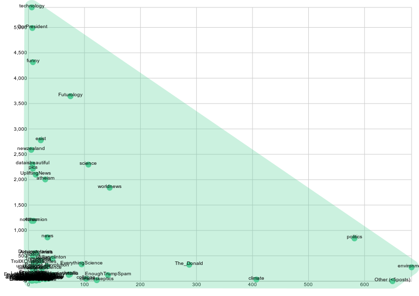 X: Cont of posts (out of the total top 5000)
Here we see that some sub-reddit forums like ‘politics’ and ‘environment’ are positioned far out to the right side, implying that more than 500 posts (of the total 5000) comes from either one of these two sub-reddit forums. However, these sub-reddits have a lower average voting-score, especially compared to sub-reddits like ‘funny’, ‘Futurology’, and ‘technology’, which has very high average voting-scores, while having fewer posts in the top 5000 image-based posts on climate.
Qualitative Image analysis
In this part of the analysis, we look qualitatively at images from specific sub-reddits concerning climate change and global warming, identified through the protocol previously described. The top ten images were examined for each subreddit of study and Reddit as a whole, which resulted in a total of 40 images. In general the most engaged with photos related to climate change on Reddit do not conform to the guidelines of Climate Outreach, in that they were frequently emotionally neutral, staged, and addressed the issue of climate change in broad terms. The images shared varied by by subreddit, which does align with the recommendation to "understand your audience" which in the context of reddit varies from one subreddit to the next. The following is a condensed account of the findings by subreddit, and the top ten images of all of Reddit. This section will end with a broader analysis of the Reddit ecosystem as it relates to visual representations of climate change.
All of Reddit
The images at the top of all of Reddit are most likely to be emotionally neutral. Most include a political figure, and are professionally taken staged photos. None were sourced from scientific sources.
r/GlobalWarming
The images from the GlobalWarming subreddit are more likely to be emotionally negative or neutral. Four out of ten of the images were from scientific sources in the form of graphs and charts. This was the only subreddit analysed where memes made it into the top ten engaged with images.
r/Science (Environment)
Of all the subreddits, only Science had an image that was emotionally positive included in the top ten most engaged with images. Though it only had one such image and the rest were either emotionally neutral or negative. None of the top ten images referenced scientific sources. Water was prominently featured in seven of the images. This was also the only sub-reddit where political figures were not featured in any of the top images.
r/Environment
The top ten photos on Environment were evenly split between being emotionally negative and neural. Half of the images contained political figures. Most of the images were closer-up photographs of people.
Network analysis of the top 5000 posts on Reddit
Question: How are images used on Reddit to communicate climate change? Can we identify distinct themes, issues or visual elements in the 5000 most engaged-with images?
Network Map: Top 5000 most highly scored images on all of Reddit on “climate change” and “global warming”, their tags according to Google Vision API, and the relations between them
 In the next visualization we show the previous network in which we have identified and named the distinct clusters of climate change images.

Analysis: Looking at the network map, it becomes apparent, that there are several clusters crystallizing into their own space. Interestingly enough a detailed reading of the map shows us, that we can identify 4 human-oriented clusters in the bottom part of the map:
Human-based clusters: In the bottom-right corner we see a dark-green cluster including images, that are tagged with “profession”, “professional”, “official”, “speech” and “public speech” among other things, implying that a lot of pictures depict some kind of public or political speech or other official events. In the bottom-left corner we see a red cluster including tags about personal traits such as “person”, “face”, “head”, “nose”, “forehead” and “chin”. This shows us, that a lot of the pictures in the top 5000 climate-posts depict a specific person in varying kinds of close-up pictures. This cluster furthermore has quite a bit of overlap with the Public Speech cluster. In the middle we see a green cluster with tags such as “product”, “technology” “text” and “line”, describing a specific kind of images that show either text or technical objects. In the middle-right side we have a orange cluster with tags and images about “crowd”, “community”, “audience” and “event”. With a lot of relations between this cluster and the Public Speech cluster, it becomes clear, that this cluster mostly describes pictures that include a kind of audience or a group of people gathered for public events - either political debates, official speeches or demonstrations.
“Human” bridge: In the middle between all of these four clusters (dark-green, red, green and organge) we have a single node, tying them all together, namely the tag of “human”, bridging the 4 clusters together and implying that they are all communicating climate change through showing human-based content; especially with a lot of content about official, political events and speeches, where big crowds and audiences of people gather.
Flora & Fauna: In the top part of the map we have two clusters, that are either specifically about animals and fauna, including images tagged with “polar bear”, “bird”, “fauna”, “wildlife” and “fish”, or about ecosystems and flora, including images tagged with “ecosystem”, “grass”, “tree” and other flora-related things. We call these Fauna and Flora.
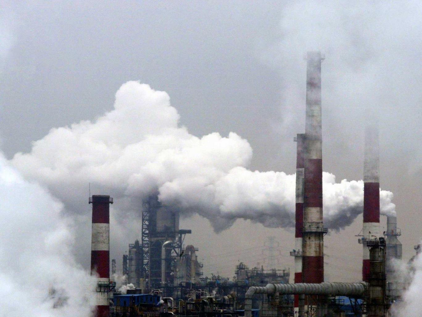
Nature-Society relation: To the right side however, we have a big blue cluster, that we call Nature-Society Interaction, that includes images that are tagged with nature-related things like “sky”, “cloud” and “water” as well as more urban tags like “city”, “transport”, “motor vehicle” and “building”. Considering the size of this cluster, a lot of images then seem to be communicating climate change visually through showing images of society in relation to nature; how cities and cars blend in with the landscapes and nature. Further this cluster shows us, that when visualizing climate change in relation to human society and especially cities, there is a lot of focus on depicting skies and clouds of pollution as well as communicating things about natural resources and especially water supply. In the relation between society and nature then, nature is often shown visually as something that is heavily challenged and polluted by human society.

Conclusion: Following this initial reading of the network, we can see a significant distinction in the network between three different things, which is shown in the layered network map above: In the bottom we have several clusters concerning human-based climate change communication, in the top-left we have a nature-based climate change communication and finally a distinct cluster of images that communicate climate change by showing images of the interaction and relation between urban society and nature.
What becomes evident here is especially that in the top 5000 most highly-scored images on Reddit there is a clear distinction between pictures that either depict human-based content; with an emphasis on political and official events, or shows nature in isolation from humans through pictures of ecosystems, landscapes, animals and fauna. The top 5000 imagery thus seems to be dominated by a dichotomy between nature and human, in which there seem to exist no positive relation between humans and neither animals nor ecosystems.
Only in the Nature-Society Relation cluster we see images that actually show an interaction between human society and nature. However, these pictures are first of all mostly focused on relations between the built society of cities, buildings and transportation networks rather than humans themselves, while the images second of all seem to showcase an overly negative relation between the human-built society and nature. This is exemplified in these two images that were both tagged with “sky” and “cloud”, “building” and “industry”:

Reflections & Further research: These initial findings crave further exploration and would benefit from a more qualitative zooming-in on specific parts of the network. For instance it would be highly relevant to look more into the node of “human”, that seems to bridge the 4 clusters in the bottom part of the network, while being very distanced from the clusters of Flora and Fauna in the top, as well as the Nature-Society Relation cluster.
Our findings especially lead us to ask a new subset of questions, like e.g.: How are humans depicted in relation to nature? Is the relation between human society and nature mostly communicated as a negative association in imagery about climate change? Furthermore we could also start to see if we can in a more explicit or direct way identify in the network map the 7 parameters of the “Best Practice” report by Climate Outreach. We could for instance code the network according to some of the parameters such as local/global, human/animal and so on to see, if there is interesting clusters or patterns in the network or if there are even any pictures in the top 5000, that live up to the criteria in the Best Practice report.
Limitations: We need to keep in mind that the network shown builds on visual data that has been coded automatically by Google’s Vision API. This means, that some of the images may be coded incorrectly, even if we have filtered the data to only keep tags with at least a 0.6 accuracy. Aside from this problem, we also have a different issue, seeing that we can never be sure, what the API choses to focus its coding and tagging on. The API tries to decode the ‘main’ content of a given image. Because of this, the Vision API might not always catch what is of actual importance in the pictures. Let’s say we have a picture of a huge crowd gathered for a demonstration, in which a guy in the crowd is holding up a sign with some political message on it. If the guy with the sign is not very big in the picture, the API might just tag the picture with
Question: Where on Reddit is climate change conversation taking place?
We looked at how our dataset of the top 5000 most highly voted image-based posts was distributed across sub-reddit forums, to get an understanding about where (in what specific sub-reddit forums) the communication about climate change (using image-based content) is taking place. We identified all the different sub-reddits forums that the top 5000 posts come from. We then calculated how many posts come from each sub-reddit forum, and also estimated the average voting-score for all identified sub-reddit forums. However, sub-reddit forums that only accounted for 1-4 posts out of the total top 5000 were merged together into an “Other” category.
Using RAWGraphs, we visualized the distribution of our top 5000 image-based posts on Reddit, showing how many posts come from the different sub-reddit forums (X) and what the average voting-score is for posts from a given sub-reddit forum (Y), resulting in the following graph.
Y: Average voting-score
Conclusion: Here we see that some sub-reddit forums like ‘politics’ and ‘environment’ are positioned far out to the right side, implying that more than 500 posts (of the total 5000) comes from either one of these two sub-reddit forums. However, these sub-reddits have a lower average voting-score, especially compared to sub-reddits like ‘funny’, ‘Futurology’, and ‘technology’, which has very high average voting-scores, while having fewer posts in the top 5000 image-based posts on climate. This shows us something very interesting, namely that while there is a lot more image-based communication on climate change in the sub-reddit forums like ‘politics’, ‘environment’ and ‘climate’, just as we expected, it is however not in these the sub-reddits that there is created the highest user-engagement (measured by voting-score). It thus seem, that we need to look to more unexpected places and forums, to find the actual best practice in the visual communication of climate change.
Furthermore, we have also categorized the different sub-reddit forums and visualized the hierarchical distribution of sub-reddits according to their average voting-score. In other words, the bigger the circle, the higher is the average voting-score (read: attention) for a post about climate change.
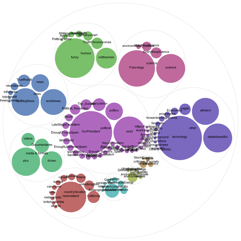
Here we see, that the sub-reddit forums that succeed in creating the greatest attention on climate change through their visual communication is especially the political sub-reddit of “OurPresident” and more humor-based sub-reddits like “funny”. Also, the explicitly climate change-oriented sub-reddits seem to create almost the lowest amount of attention, seeing that the sub-reddits such as “green”, “energy”, “Renewable Energy” are all very small in the light-blue cluster in the bottom-middle, while this is also the case for the green climate-group of “environment”, “sustainability”, “GlobalWarming” and “climate change” sub-reddit forums, that are all equally small in the bottom-middle of the graph. In fact, these two groups of sub-reddits seem to create the least attention out of all the sub-reddits, when you look purely at the average voting-score. This leads us to asking new questions like; what are the differences in the ways that these traditional, straight-forward climate change sub-reddits communicate climate change, and how is that different from how climate change is communicated visually in e.g. “funny” or “Futurology” or other highly voted sub-reddits?
-- NataliaSanchez - 17 Jul 2017Topic revision: 17 Jul 2017, NataliaSanchez
Ideas, requests, problems regarding Foswiki? Send feedback