You are here: Foswiki>Dmi Web>VulnerabilityClimateChange>EmapsAmsterdamSprint2014Project5EuropesReadinessToAdaptToClimateChange (07 Apr 2014, ErikBorra)Edit Attach
Project 5: on Europes readiness to adapt to Climate change.
Report by: Rik van eijk and Wannes Sanderse
Introduction
The EMAPS sprint in week 13 of 2014 had as main subject climate change vulnerability and the addressing of this issue by different organizations, governments and individuals. Teaming up with designers, collectors, experts and students from all of Europe, the group, containing a total of somewhat 30 people, were divided into seven project groups, each with an expert providing the issue that should be researched. This paper contains the results of the data sprint that group five did at a request of EEA project managers Hans-Martin Füssel, answering the question: Are those countries leading in mitigation are also leading in adaptation or are the ones who leading in mitigation lacking in adaptation? This project is divided into 2 parts, coördinated by PhD student Michele Mauri. One part was taken care of by Mario Porpora, Chiara Gagliardi and Eleonora Grotto, all members of the Milan based Density Design, focussing on the data collection and visualization answering the first set of questions requested by Hans-Martin Füssel. The second part of the research report focusses on a more experimental question proposed by Füssel, and has been executed by University of Amsterdam students Wannes Sanderse and Rik van Eijk. Each part has their own method, results, findings and conclusions that will be documented in this report. Though this introduction introduces the idea that there is a boundary between the two sub-project, without the help of each project member, none of the projects would have provided a sufficient result.Method and results: sub-project 1
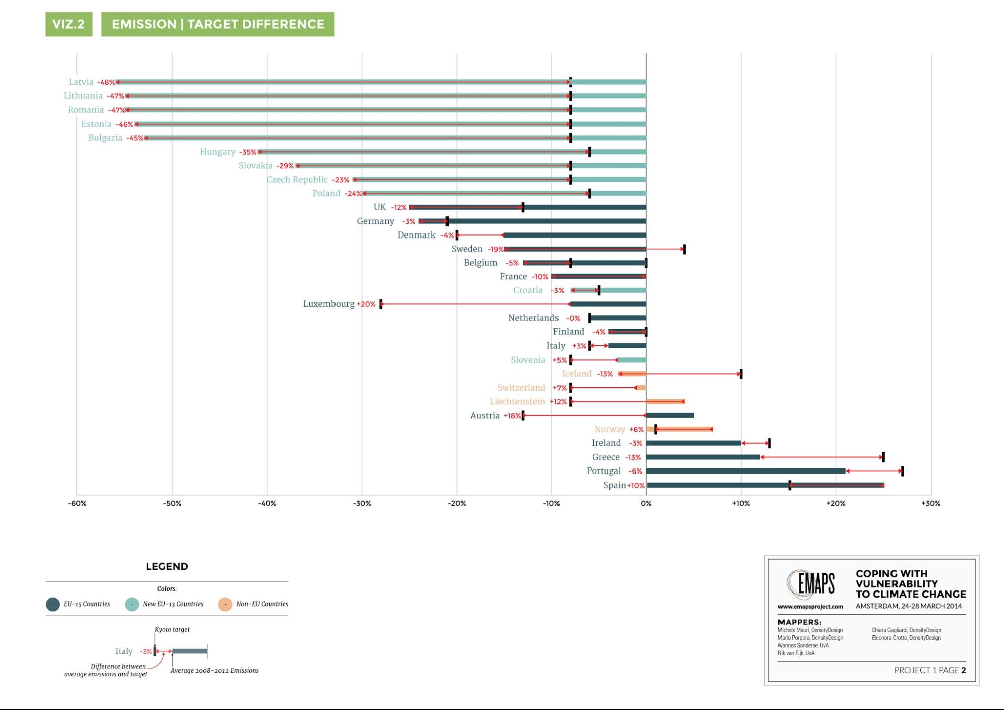
The first research question Hans-Martin Füssel provided our group with was: Are those countries leading in mitigation are also leading in adaptation or are the ones who leading in mitigation lacking in adaptation? To answer this question he also gave us the following data: The adoption of adaptation strategies in Europe broken down by year, the average emissions and emission targets for the kyoto protocol for Europe and Europe's population statistics.The Density Design team visualized the Kyoto emission targets and the percentage of emission reduction of the country. By visualizing this, one has a fast and clear image of either the target, the real emission reduction and the difference between the two. Also the hot air phenomenon is clearly visible, all Eastern European countries emit significantly less than other European countries. This is because of t he decline and deindustrialization of post-communist countries. This also means that these countries have a lot of emission rights they can sell, meaning the global price of emission rights dropped significantly. Visualisation 1: Average 2008-2012 CO2 emission in Europe. Click here to enlarge the picture. Visualization 2: the Kyoto emission targets, visualized in combination with the real emission reduction per country. Click the picture (or here) to enlarge. The second visualization that had to be created was more difficult. The data provided by our expert lacked information on some countries. To solve this we searched through the EEA report manually and found that there are six stages in the adaptation process: not yet started, agenda setting stage, formulation stage, decision stage, implementation stage and the monitoring and evaluation stage. We found information on almost every country, however because it involved a lot of reading and interpreting we created an annotated document that shows on which passages we based our claims on each countries stage in their adaptation plan. Visualisation 3: Adaptation (policies) vs mitigations (emissions). Click here to enlarge image.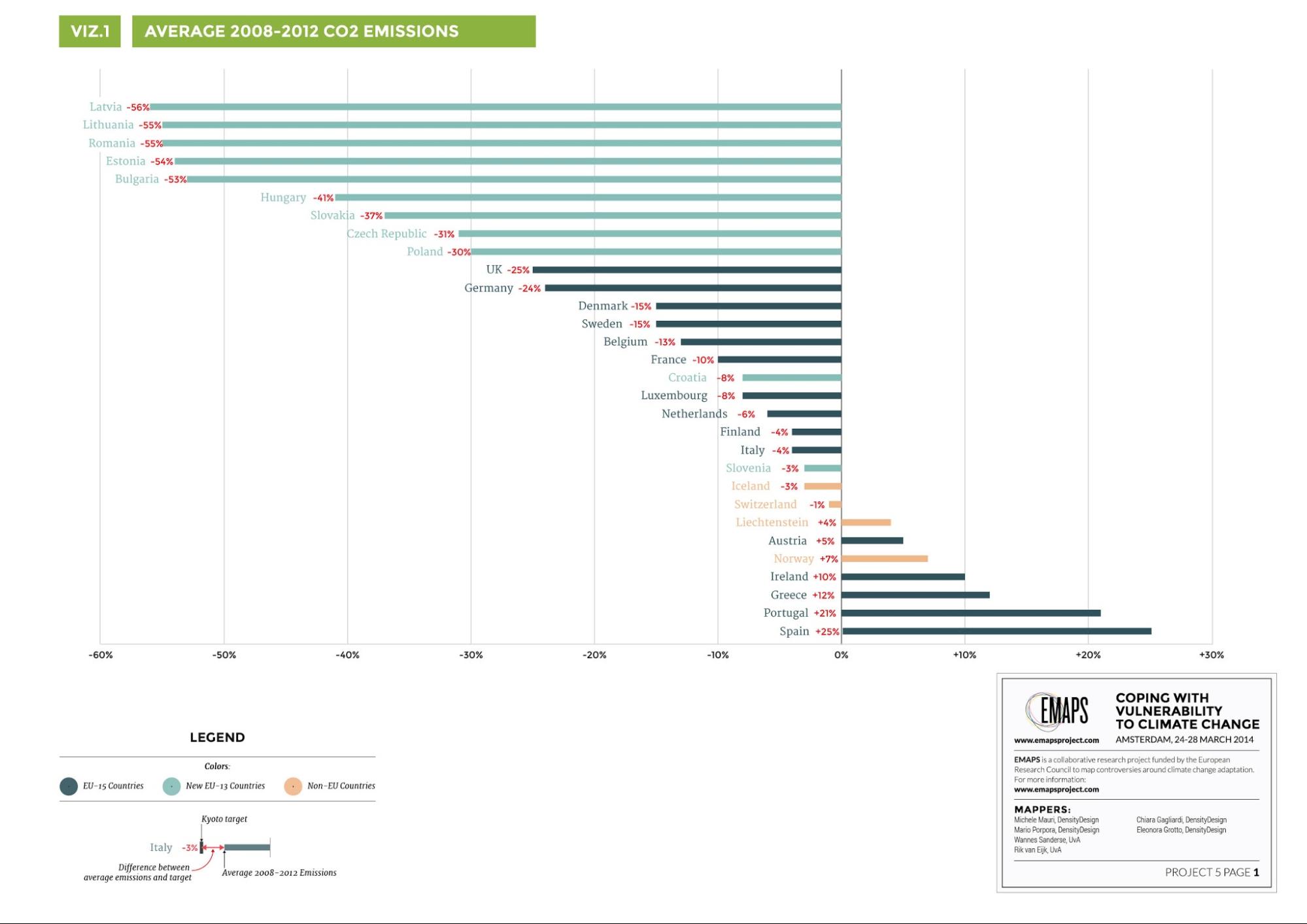
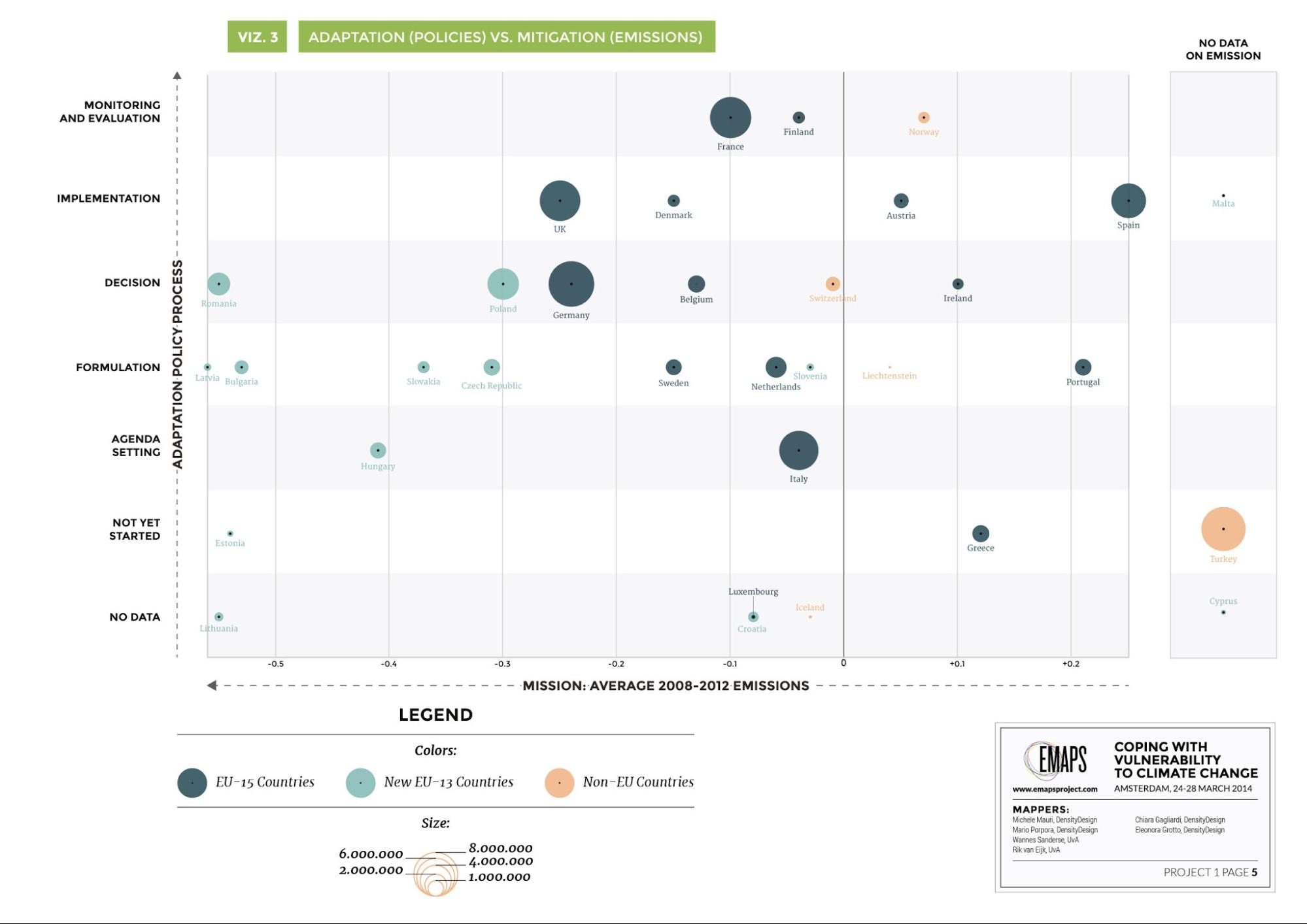
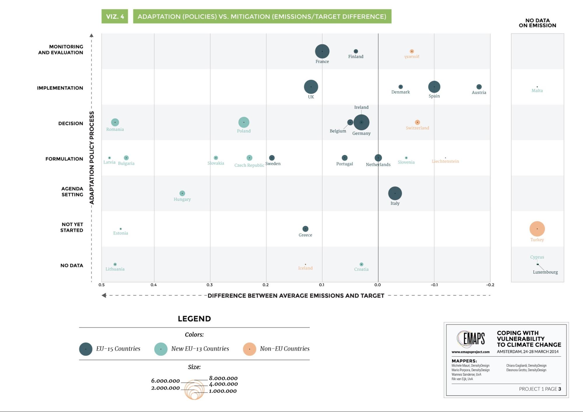
Visualization 4: The target difference between mitigation and adaptation policies. Colour represents country groups. The column on the right contains countries with no emissions data. Vertically, the stage in adaptation policy process. These are categories (not numeric values). countries doing well with mitigation are on the right. Countries doing well with adaptation are on the top. Click here for a larger visualization. By reading adaptation policies, the implementation of these policies and combining them over a time period, the research group was able to create a advanced database in which stadium the countries of the European Union and some non-EU members belonged in relation to adoption policy. This information was found on the Climate Adapt section of the website of the EEA and aggregated in a way one could easily find why the research group added a certain country in a certain group. The project members were able to visualize this in a way that the adoption stages were combined with the population, thus creating an image of the amount of population of the EU that were influenced by an adoption strategy. This visualization is shown in visualization 6.
Visualisation 5: The amount of people covered by adaptation policy. Click here here for enlargement.
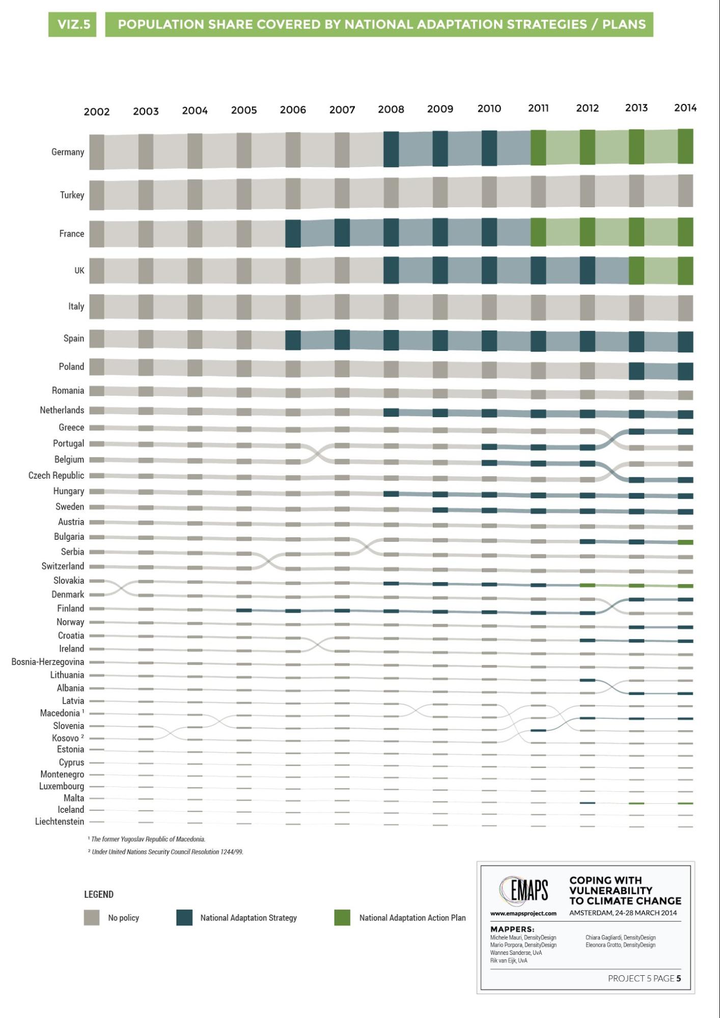
Visualization 6: adaptation policy, aggregated on the EEA website. Information visualized in combination with population. Click here for enlargement.
Findings and Conclusion
The most important finding of the first two visualisations is that you can clearly see how the hot air phenomenon is weighing the graph in favor of eastern europe. This phenomenon makes it difficult to draw hard conclusions on actual Emission data from the other countries in Europe, but functions well in showing this phenomenon nonetheless. It is hard to draw any hard conclusions from visualisation 3 and 4 because the hot air phenomenon interferes again. However you can say that countries who in both visualisations, are in an advanced state of adaptation do not necessarily emit less, France for example emits less and is in an advanced state of adaptation, but Norway is at the same level of adaptation but emitted more. The fifth visualisation shows that there is no direct correlation between population size and climate change adaptation plans, turkey is one of the biggest countries in europe but does not have an adaptation strategy, yet Slovakia is in the final stages of adaptation planning and has a small population. The sixth Visualisation tells the chronological story of which countries implemented climate change adaptation and when they did it. It is a good visualisation to use when telling the story of climate change adaptation in Europe because it shows many significant additional factors, like which nations are part of the EU 15, the population sizes covered by these adaptation policies and when the Kyoto protocol was established. We hope that these requested visualisations can really help Hans-Martin Füssel in his research and maybe help raise awareness of the many issues involved in this complex debate.Method: sub-project 2
Relating the issue of vulnerability and climate change, there are different ideologies, philosophies and/or ethics justifying funding allocations. Asked by the expert to focus on three alternative philosophies, the project group tried to find a way how to approach it. The three alternative philosophies provided are proportionality, utilitarian and egalitarian philosophies, showed in a table below:| Principle | Allocation principle for adaptation funding | Countries favoured | Data assumptions |
|
Proportionality |
Proportional to damages |
Countries with large (potential) damages | Find GDP per capita per country combined with the average death rate of climate change in that country and rank them accordingly |
| Classical utilitarianism | Maximize adaptation benefits regardless of location | Countries where adaptation is relatively cheap | Rank poor countries with good governance. Poor with good governance at the top. |
| Equitable results (egalitarian) |
Preserve the current distribution of climate-sensitive goods or bads (i.e., risks) | Countries with large (potential) damages where adaptation is relatively expensive | GDP per capita per country combined with adaptation strategy
|
- The adaptation index (EU only): in what stage is a country in making laws relating to the issue of vulnerability and climate change. We used the same information gathered by the team working on the first part of the project, so it is based on reading the 2014 EEA Report on National adaptation policy processes across Europe.
- The RISK index (EU only): What is the risk that a country will be hit by climate change. We did not find the right data to fill this index, so we did not use it in our calculations. Instead we took the average death rate due to climate change in the last 20 years as an indication for climate risk.
- The Corruption index: We took this data from transparency international's Corruption Perception Index. This index measures how much countries perceive themselves as corrupt. Transparency international collects this data through reputable institutions. The idea behind this is that corrupt countries could possibly abuse the adaptation funding, so if a country has a high CPI, meaning it is perceived to be less corrupt, it should get more funding. In the utilitarian philosophy this is most important because funding should go to where it could help the most, a country with good governance.
- The GDP: Gross Domestic Product, based on the latest world bank data, to see how much capital is at stake in a country. We used the GDPPP instead because we reasoned that a country with more wealth per person would stand to lose more. So this is not part of any calculation, however still included in the dataset so easily useable if some where to reason differently.
- The GDPPP: Is the GDP per capita, but also takes into account the real growth, price inflation, and exchange rates to provide a better overall measure of the real value of output produced by an economy compared to other economies.
- Population density index: the assumption behind it is that how dense a country is, more of the population is helped by an investment contradicting climate change than a less dense country is. This information was collected from the latest World Bank data.
- Average death index: the amount of people that died from climate change during a twenty year period. As said above, this information is used to decide how vulnerable a country is. This information is extracted from the Germanwatch database on climate change vulnerability.
- Proportionality: Index GDP PPP * Index Death rate
- Utilitarianism: Inverse Index GDP PPP * Index Corruption * Population density index
- Egalitarianism: Index GDP PPP * Index Death rate * Adaptation phase * Corruption index
Results (EU only)
| Rank | Proportionality | Classical utilitarianism | Egalitarian |
| 1 | Luxembourg | Malta | France |
| 2 | France | Netherlands | Spain |
| 3 | Italy | Belgium | Switzerland |
| 4 | Spain | UK | Belgium |
| 5 | Switzerland | Germany | Germany |
| 6 | Portugal | Poland | Portugal |
| 7 | Belgium | Italy | Netherlands |
| 8 | Germany | Portugal | Austria |
| 9 | Netherlands | Cyprus | Italy |
| 10 | Iceland | Denmark | UK |
| 11 | Slovenia | Czech Republic | Slovenia |
| 12 | Croatia | Hungary | Norway |
| 13 | Cyprus | France | Hungary |
| 14 | Austria | Turkey | Romania |
| 15 | UK | Slovenia | Poland |
| 16 | Hungary | Slovakia | Latvia |
| 17 | Romania | Romania | Ireland |
| 18 | Latvia | Switzerland | Czech Republic |
| 19 | Greece | Spain | Malta |
| 20 | Poland | Croatia | Slovakia |
| 21 | Czech Republic | Austria | Denmark |
| 22 | Lithuania | Ireland | Bulgaria |
| 23 | Norway | Greece | Greece |
| 24 | Slovakia | Bulgaria | Sweden |
| 25 | Ireland | Lithuania | Turkey |
| 26 | Bulgaria | Luxembourg | Estonia |
| 27 | Turkey | Estonia | Cyprus |
| 28 | Malta | Latvia | Croatia |
| 29 | Estonia | Sweden | Lithuania |
| 30 | Sweden | Finland | Luxembourg |
| 31 | Denmark | Iceland | Finland |
| 32 | Finland | Norway | Iceland |
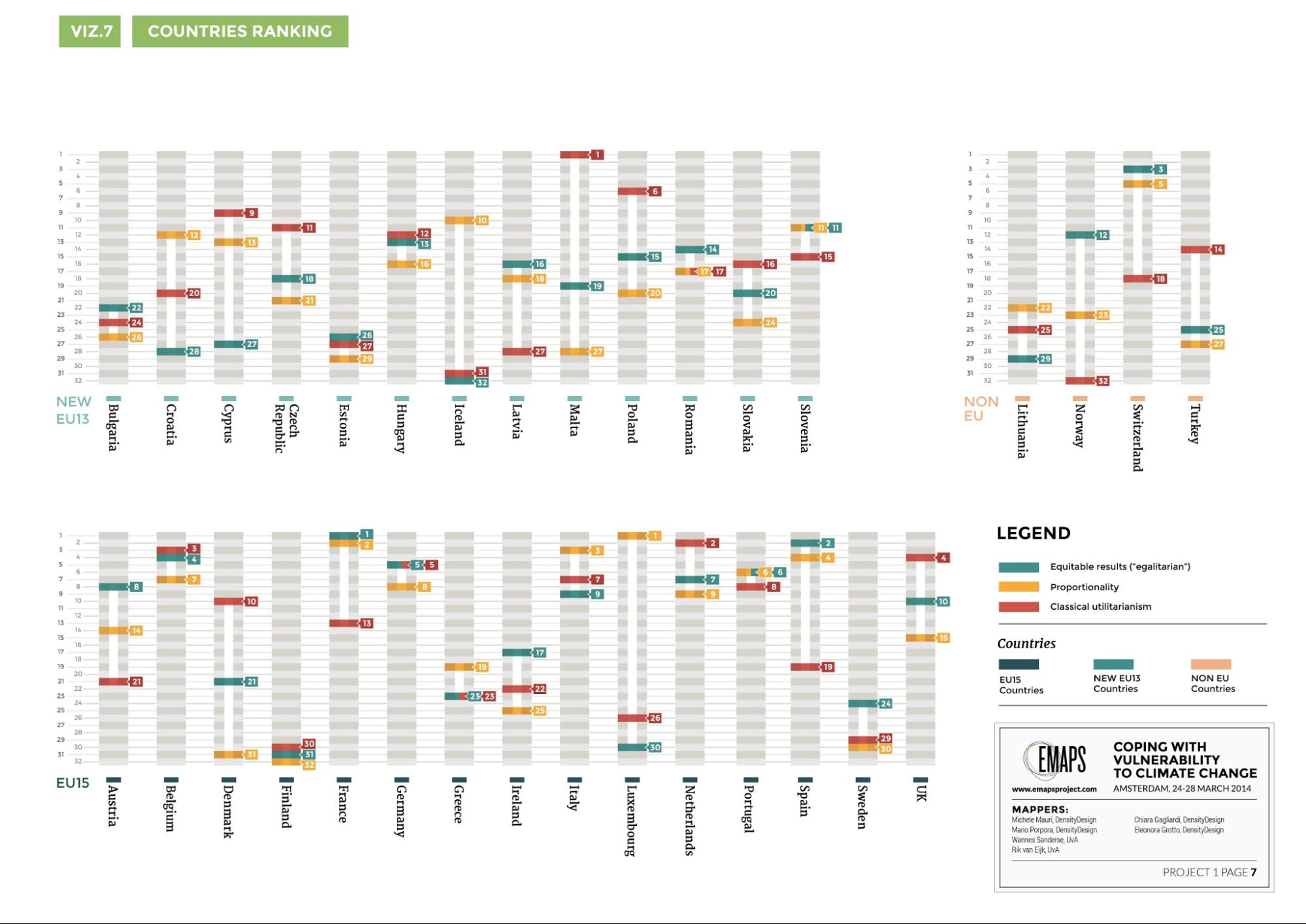
Visualization 7: Bar graph of the results (EU only). The color corresponds with a philosophy. The higher the colored bar, the more the country should receive funding. The difference between the highest and lowest bar is the difference in principle a country should enhance. Click here for enlarged version.
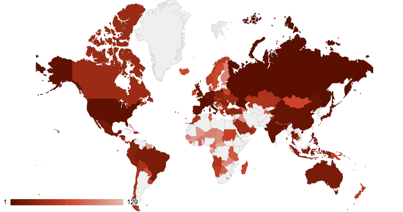
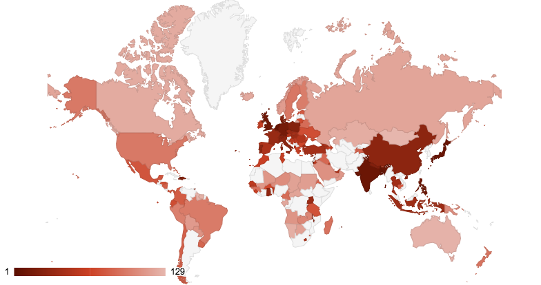
Proportionality: Visualisation 8. Showing a heat map of the proportionality philosophy. the darker the country the more funding they should receive under this philosophy. Utilitarianism: Visualisation 9: Showing a heat map of the utilitarian philosophy. the darker the country the more funding they should receive under this philosophy.
Findings
As you can see on visualisation 7 there are significant differences in funding allocation when following these different strategies. When reading this map one should look at the two things, how high the lines are because this relates to how much funding they should get and how much white is between the lines because this indicates a discrepancy between funding allocation in different philosophies. A good example of these differences is Malta, in the utilitarian philosophy it ranks number one because it has a very dense population, a good CPI and less GDP PPP. This means that in this country you could achieve the most in climate change adaptation so it should get the most funding. Or Iceland who ranks almost last in both the Utilitarianism and the egalitarian philosophies, yet at a respectable number 10 in the european ranking for proportionality. This is because Iceland has much to lose to climate change, so it ranks high in proportionality, yet according to our data does not have a plan to cope with adaptation so it should not receive funding according to the egalitarian philosophy and ranks at the bottom. This shows our method works, it is possible to compare these philosophies on the basis of readily available data. On the world map you can see that most of the darker countries of the proportionality map are either the richest countries or the countries that have had the most lives lost due to extreme climate change events. in the utilitarianism map you see that the darker countries are all of the countries that have good governance and a high population density are ranked highest, the poverty factor is largely negated by these in mostly african countries. It might be a good idea to increase the weighting of the inverse GDPPP, than it might reflect the utilitarianism philosophy more because they believe that poor countries should receive more than rich countries because you can do more good with less money. You could also make a separate list containing only the developing countries to illustrate where funding should go within these countries by the same standards, then you would not see the wealthy, well governed EU countries appear so high. This is a good example of philosophy where further tweaking is required.Conclusion
We devised a method that makes it possible to follow alternative philosophies/ethics on just funding allocation, and shows which European countries should get the most funding. Of course there is still a lot of work to be done to refine this method, but we have shown that it is possible to do. We have used simple formulas that are easily expanded upon, thus making this method highly adaptable. The output of this method is a ranked list of countries, this makes it very easy to visualize and through this analyze. However there is a downside to making the formulas more complex. The more different data you add to enhance the effectiveness of the formulas representation of the philosophy the more likely it is to shorten the list of countries because the data might not be available for all countries. For example we considered to use the road density index in combination with the population index to create a number that would more accurately describe how remote or not remote locations in a country are. But the road density index information in the world bank only had information on a select amount of countries, meaning that we would have to exclude countries and shorten our list significantly. This leads to a debate on whether or not you should add this data to increase philosophy representation or leave it rough as is to increase country reach. However you could update this information every year in the hope that more data will become available on more countries. You could also see shifts in ranking between countries, you could already do this retroactively by using data from previous years instead of using the most recent.Further suggestions
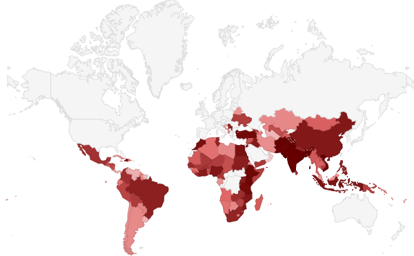
To improve our Global maps, we need more data. We need a way of rewarding countries for good policy on climate change, so we can create a world map for the egalitarian philosophy. This data however needs to apply for the whole world, because else we would only scale down our list of ranked countries. We need to Include climate change Risk in Proportionality and egalitarian Philosophy. Right now this is only represented by the average deaths due to climate change events, the risk of possible extreme climate events happening in a country would greatly improve the proportionality and egalitarian philosophies. However Climate Risk shoul d only be based on the possibility of extreme climate events happening if it includes the average death or GDP than it would favor the countries that already score high in these factors. The main suggestion to move this project further resides in comparing this list with other lists, for example the list of countries where adaptation funding is actually going that project group 4 assembled. A quick comparison shows it looks like this:Actual OECD funded countries Visualization 10. Shows a heat map of where actual OECD funding is going, the darkest being the most funded. However there is a problem with this comparison, a lot of the funding is distributed across groups of countries or territories. For example the funds going to South America Regional do not show up on the world map. Also there is very little data available about most developing countries where funds are actually going, so a comparison is hard to make for a significant amount of countries. However with these maps a step has been made in comparing actual funding with funding philosophies. Another interesting avenue to take this research to is to add other philosophies on funding so you can compare them. For example Solidarian, Neo-liberal or libertarian philosophies could also be expressed in data. It is also conceivable to make a tool where people can devise their own philosophy by combining the element they think are important. if you think that good governance and risk is very important you can only put these in and see what list is produced. This could raise more awareness on how funding is distributed, how people think it should be distributed and about the climate funding debate itself. It would be great if this tool automatically visualized these outputs as well, in a world map and the bar chart visualisation 7. uses. The world map would be very useful in showing the user how their choices affect funding worldwide and the bar charts would be perfect for showing the differences between the users own thoughts, other philosophies and actual funding distribution.
literature:
Isoard, Stéphane. EEA Draft Report on National adaptation policy processes across Europe. Unpublished. Will be published after comments in Autumn 2014. Current draft dated 17th February 2014. Transperancy.org. 2013. Transparency international. 28 March 2014 < http://cpi.transparency.org/cpi2013/results/#myAnchor1> Worldbank.org. 2013. World bank group. 28 March 2014 < http://data.worldbank.org/ >Edit | Attach | Print version | History: r1 | Backlinks | View wiki text | Edit wiki text | More topic actions
Topic revision: r1 - 07 Apr 2014, ErikBorra
Ideas, requests, problems regarding Foswiki? Send feedback