One game, multiple visuals? Mapping the multi-language Twitter on the FIFA World Cup
Team Members
Facilitator: Carlos d'Andréa (Federal University of Minas Gerais, Brazil / visiting scholar at University of Amsterdam). Research team (in alphabetical order): Antonio Martella (University of Pisa) | Carrie Anne Karsgaard (University of Alberta, Canada) | Dan Xu (Digital Society School, Amsterdam) | Dasha Kravets (Free University Berlin, Germany) | Erika Valderrama (London School of Economics, UK) | Giacomo Flaim (Density Design/Politecnico of Milan) | Giovanni Scala (University of Amsterdam) | Markus Stauff (University of Amsterdam) | Mick Jongeling (Digital Society School, Amsterdam) | Trisha Lee (University of Amsterdam)Contents
Summary of Key Findings
- Specificities (and similarities) of ad hoc language-oriented publics - Networks and Time Series: complementary analytical perspectives- Google Vision API - Retraining the (label) machine
1. Introduction
From June 14th to July 15th, 2018, football fans (and many curious viewers) worldwide got involved, in different ways, with the Russian edition of the FIFA World Cup. Broadcasted live to 203 countries, this mega-sporting event is also a singular moment for Twitter users: according to this social media platform, the previous edition (World Cup 2014, in Brazil) generated approximately 672 million tweets. The deep-mediatized dynamics (Couldry & Hepp, 2017) of this sports media event and its entanglement with commercial, political and entertainment topics allowed us to assume that the 2018 FIFA World Cup (WC2018) was intensively ‘issuefied’ (Marres, 2015) on Twitter. Considering the intensely visual character of the sport event, this project aimed at mapping the photos, videos, memes etc that help to articulate issues and their publics.
More specifically, the project wanted to understand how language-specific publics appropriate different kinds of visuals to raise and discuss issues concerning sports, media, politics and other topics: In other terms, we would like to better understand how the different national and regional publics differ or overlap in the way to issuefy the WC2018. This also implies asking how the dynamics of the events itself (its schedule, its unpredictable outcomes, its legally and industrially restrained production of images etc.) and the wider dynamics of the social media platform (its conventions of hashtags and memes, its language-specific publics etc.) combine and play out in the user practices.
2. Initial Data Sets
Using DMI-TCAT (Borra & Rieder, 2014), before and during the WC2018 separate datasets were collected separately with keywords and hashtags related to 19 different languages. The research team chose to focus on an initial dataset of 12 million tweets with the terms/hashtags ‘wc2018’, ‘fifawc’ and ‘worldcup’.
To reduce the amount of tweets and to focus on a more specific period of the sports event, we first concentrated on a 6-days period (from June, 27th to July, 2rd) which included the final matches of the group phase and the initial matches of the knockout stage. In total, 3.334.226 tweets had been collected in this 6-days period. This allowed for analysing the more general interconnection between the WC2018 schedule and the ebb-and-flow of tweets.
Secondly, we deeply explored a 7 hours-period (3 hours of the game itself plus 2 hours before and 2 hours after the game) related to the match Spain-Russia (July 1st). The match is an interesting case for multiple reasons: 1) The host country (Russia) was one of the two teams that were playing the match; 2) There was a controversy with the newly-adapted Video Assistant Referee (VAR); 3) A title favorite (Spain) was eliminated from the tournament. In total, 286.895 tweets were collected during this period.
To operationalize the goal of understanding how language-specific publics appropriate different kinds of visuals, sub-datasets based on specific ‘interface languages’ (= the language users chose as default for their account) where also generated. Assuming that this "reasonably stable measure" could be taken as an "indicator of language preference" (Sloan, 2016), three ‘interface languages’ were selected to be explored in depth for the 7 hour-period:
-
‘Russian’ - 8.174 tweets (55% with media embedded)
-
‘Spanish’ - 23.946 tweets (58,2% with media embedded)
-
‘Japanese’ - 19.632 tweets (35,6% with media embedded)
3. Research Questions
- How is the 2018 FIFA World Cup visually appropriated by national, regional and language-specific Twitter publics?
- What kind of topics (related to sports, media, brands, politics etc) are issuefied in the context of the sports event - and provoked by which dynamics?
- To what extent can language-specific hashtags and Twitter ‘interface language’ be used to study the national and regional specificities of a major football competition?
4. Methodology
The research design created by the team is summarized in the protocol below (Figure 1)

Figure 1 - Research protocol
In both moments - “Week Analysis” and “Match Analysis” - the starting points were the ‘Media Frequency’ tables extracted from DMI- TCAT. This data informs the frequency that each visual (still images, GIFs or videos) was shared by Twitter users.
The media’s URLs extracted from TCAT were processed in two methodological efforts, providing complementary types of visualizations (‘outputs’):
4.1 - Image-label networks (with Google Vision API)
Using a Python version of the script ‘Memespector’ (created by Andre Mintz), the images were downloaded through their URLs and sent to Google Vision API to be ‘labeled’ by Google’s computer vision tool. Google Vision API allowed us to perform a simple visual content analysis identifying images’ content and labeling it. The first outputs of this process were bipartite graph files that show the connections between the images and the labels attributed by Google Vision API. The network’s files were visualized on Gephi with the intention of identifying the main clusters of images (Figure 2)

Figure 2 - Intermediary version of a Image-label network (see Figure 3 for a final version)
The network visualizations were later exported to Illustrator/Inkscape, in which, using the script “imagenet plotter” (Mintz, 2018), it was possible to insert the images files in the network, generating the data visualizations published in the section “Findings”. In this final network visualizations, the labels provided by Google Vision API were replaced by ad hoc thematic clusters proposed by the project team after a collective qualitative analysis.
4.2 - Time series (with Image Plot)
Using “Media Frequency” outputs divided by hour, the sharing of the images over time was visualized using the software ImagePlot. The hourly time series of the most shared images were also visualized according to the three interface languages: Spanish, Russian and Japanese (see “Findings”)
4.2 - Qualitative Visuals Analysis
The two previous methodological efforts provided a quantitative understanding of the visuals, but they lack the context in which those visual were shared. For this reason, we conducted a qualitative analysis of the tweets which contains the top 100 most popular visuals. This analysis was conducted for each of the three relevant languages: Spanish, Russian and Japanese by tagging the relevant characteristics in which the visual were shared.
5. Findings
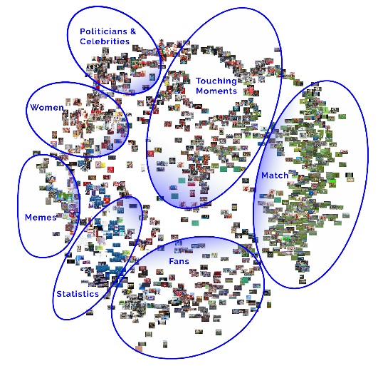
The use of two complementary types of data visualization (image-label networks and time series) allowed the team to understand both the diversity of images shared during the two studied periods of time, and the dynamics of the popular images circulation over time. 5.1 - Image-label networksThe first image-label network (Figure 3) presents an overview of the most shared images during the 6 days-period (June 27 to July 2) that was first studied.

Figure 3 - Image-label network during a 6 days-period (June 27 to July 2)
In order to provide an overview of how a specific moment of the 2018 World Cup was ‘issuefied’, the descriptive labels provided by Google Vision API (Figure 2, above) were ‘re-tagged’ in a qualitative analysis. In the clockwise direction, the seven clusters proposed by the research team are:
- ‘Touching moments’ - composed mostly by images of players celebrating or regretting.
- ‘Match’ - images directly related to the matches events. The predominance of green indicates the high presence of pitch images.
- ‘Statistics’ - specially tables with results and updated standings, most of them with FIFA branding (blue images)
- ‘Fans’ - images of supporters, generally in a crowd
- ‘Memes’ - relatively small section, includes cat pictures and cartoon frames (e.g. Simpsons and SpongeBob)
- ‘Women’ - largely sexualizied pictures of models and/or female supporters
- ‘Politicians & Celebrities’ - includes differents personalities, with predominance of the Russian president Vladimir Putin
In almost all cases, the images seem to be appropriated from television or professionally-run Internet resources - i.e. few user-generated images and “personal” experiences of the game. Thus, the image-label network doesn’t reveal a heterogeneous issuefication of the World Cup. Most imagery is dominated by official channels or FIFA branded content, with memes circulating predominantly around victories/losses (i.e. cats with flags on their backs, walking sorrowfully away). While a small “boycott Russia” cluster emerges in our Russia-specific map (below), no other political issues are visibly evident through our maps. Without a comparative case (i.e. previous World Cup data), it is difficult to draw conclusions here; instead, we can only infer that (a) the 2018 World Cup is not used to issuefy other topics than the competition itself; and/or that (b) FIFA branding, “official” hashtags/images, and the established visual conventions of sports (scenes from the game plus emotion plus fans) are dominating the network so that resistant/critical voices are marginalized.
For the analysis of the second dataset - the shorter 7-hour period around the match Spain x Russia -, the following image-label networks show the most shared images by users who chose ‘Spanish’ (Figure 4), ‘Russian’ (Figure 5) and ‘Japanese’ (Figure 6) as their “interface languages”.

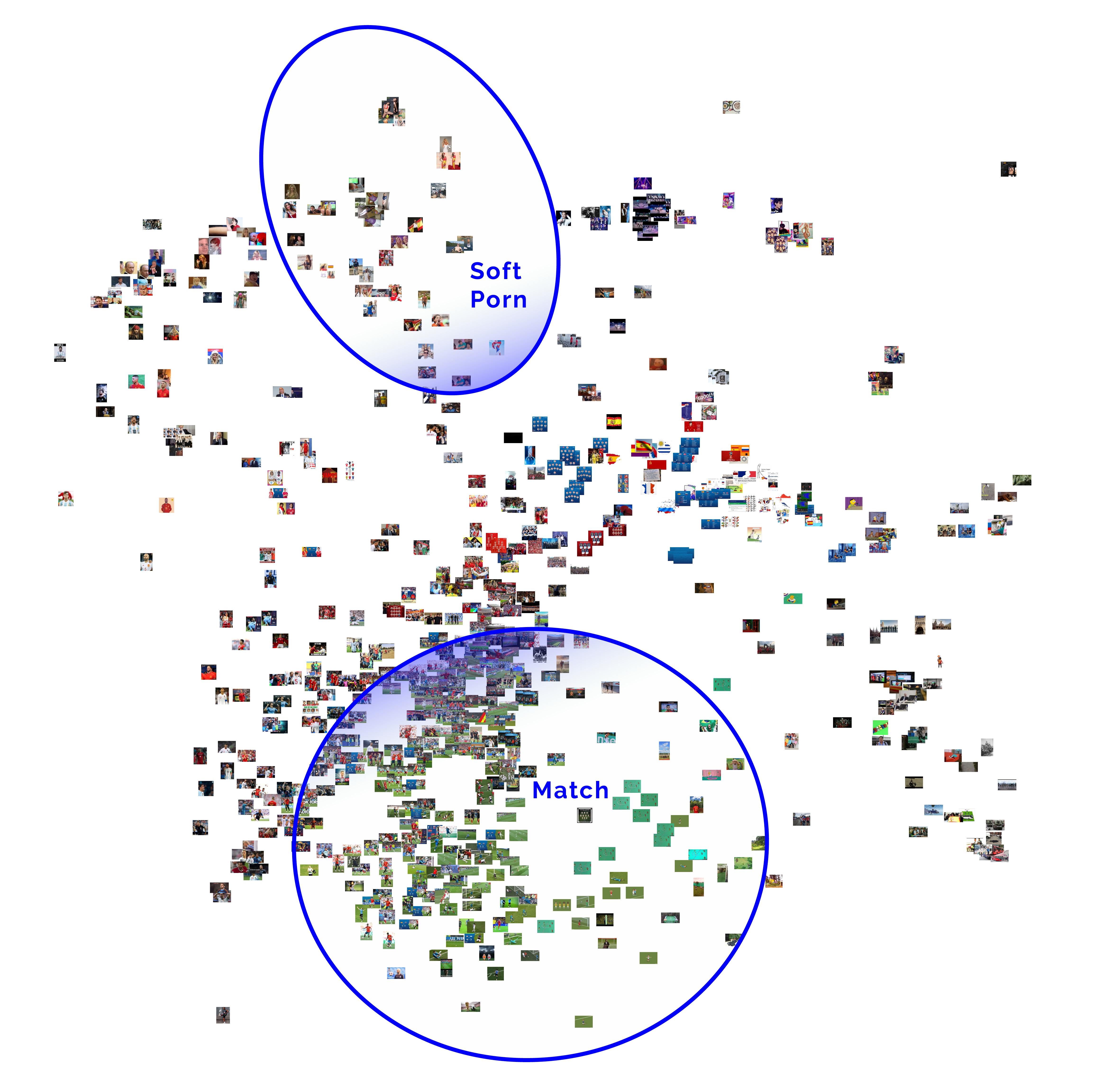
Figure 4 - Image-label networks with the images shared by Spanish “interface language”
Events surrounding the game, including players’ personal lives outside of match are more present than the match itself. The highlighted clusters are 1) ‘Soft porn’ (top-left): women wearing bikinis and men without shirts - one of these shows the Russian president Putin in a sunbath; and 2) ‘Match’ - photos of the knockout match, with predominance of pinch images (in green).

Figure 5 - Image-label networks with the images shared by Russian “interface language”
The highlight here is the predominance of national specific images. There is a much less FIFA official tables. In the bottom of the graph, the cluster ‘Boycott Russia’ indicates a (peripheral) presence of images related to the political campaign against the host country.

Figure 6 - Image-label networks with the images shared by Japanese “interface language”
The main singularity of the Japanese image-network is the presence of ‘Cartoons” and “Design & Art’ images - this latter cluster includes match-related tables. About the gender representation, 'Men' cluster show that fashion is more male-related, and all the women in the graph are in mangas. No porn or domestic political issues were identified.
5.2 - Time series
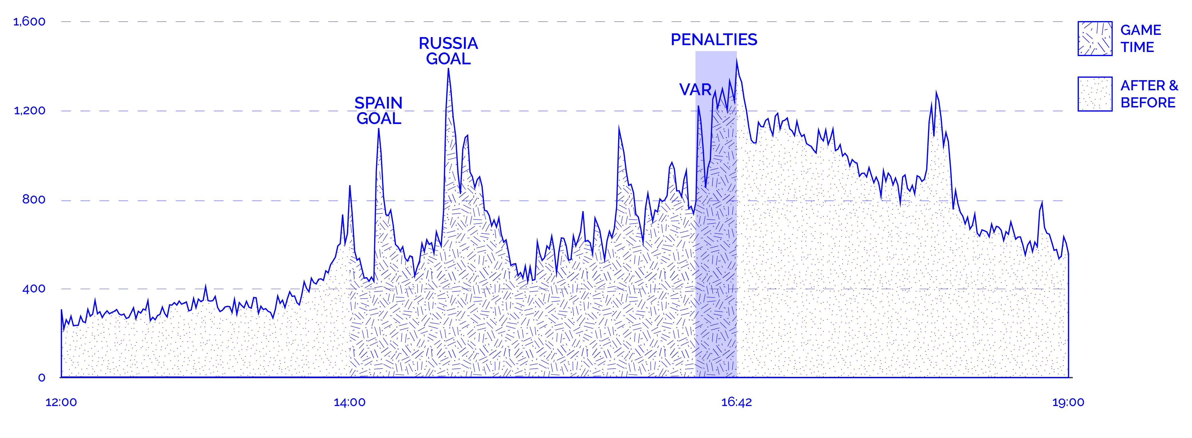
The second methodological efford is based on ‘time series’ of the most shared images during the match Spain x Russia. To allow a more accurate analysis of the image circulation over time, the graph based on the ‘Log of the match’ (Figure 7) connects key moments of the match with tweet frequency. Not surprisingly, the overall ebb-and-flow of tweets is very strictly connected to the predetermined schedule of the World Cup (much more tweets during and shortly before/after games) and to specific, unpredictable events during each match. Thus, the peaks of the graph represent a significantly higher volume of tweets triggered by the Spanish goal, the Russian goal, the VAR occurrence, the announcement of extra time, and, finally, the penalty shoot-out.
 LOG
LOG
Figure 7 - ‘Log of the match’
Generated with Image Plot, the first ‘time serie’ shows the shared images by hour in all interface languages (Figure 8)
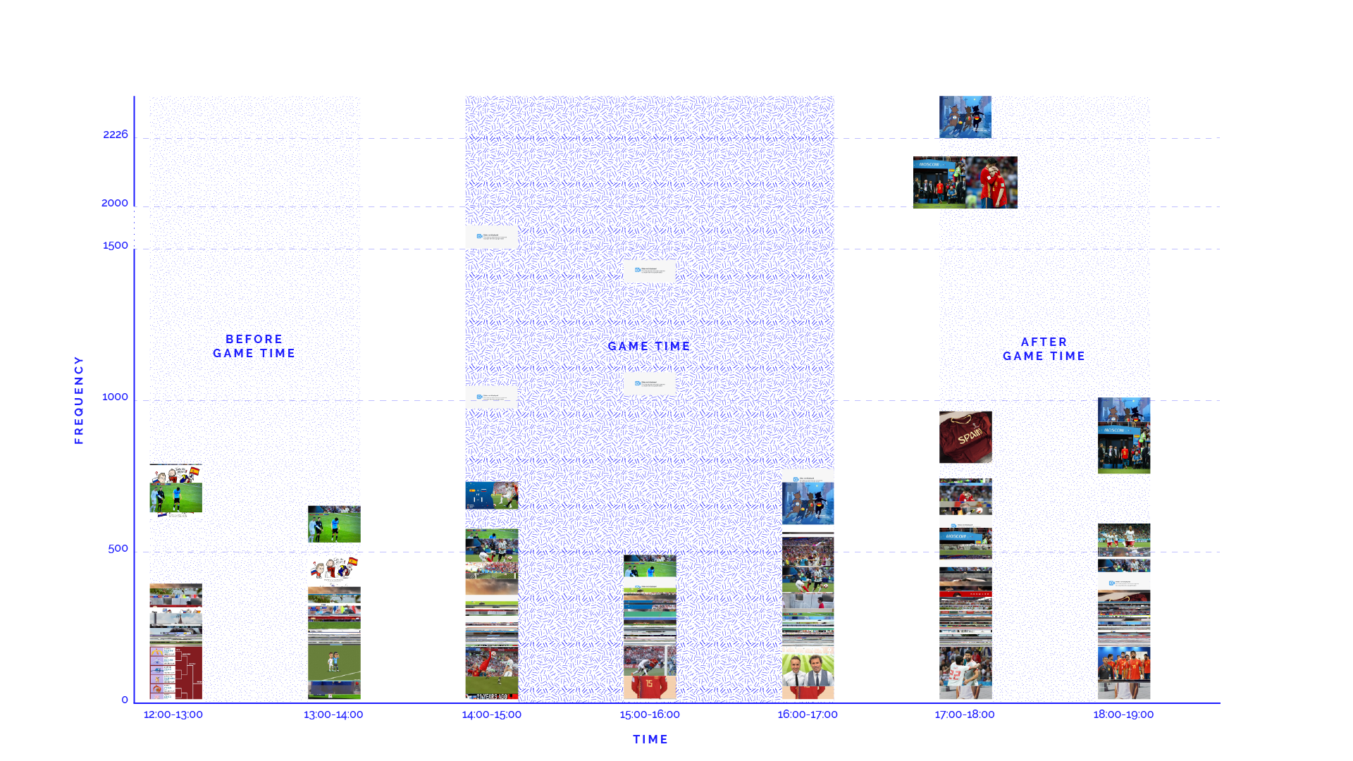
Figure 8 - Most shared images before, during and after Spain x Russia (all languages)
Before the match, there is a predominance of images related to a match of the previous day (Portugal x Uruguay), as well the branded content from FIFA and UEFA.
During the match, a video fragment showing the injured Spanish player from behind moving his arm as if masturbating was intensively shared; while this is one of the few examples where a situation became memefied rather because of the 'funny' gesture than because of its meaning for the game; most other highly-shared images relate to significant scenes from the game itself: the hand ball of Spanish player Pique and the final penalty-save by the Russian goalkeeper Akinfeev.
After the match, the images that become dominant are those that condense the result and the consequences of the game, for instance by focusing on the sentiments of a player (Andres Iniesta) as symbols for Spain unexpected defeat. Amoing the memes shared, one appropriated from the cartoon Tom & Jerry shows four cats with flags representing three other major teams previously eliminated (Argentina, Portugal and Spain) leaving with the new ‘upset’ team (Spain).
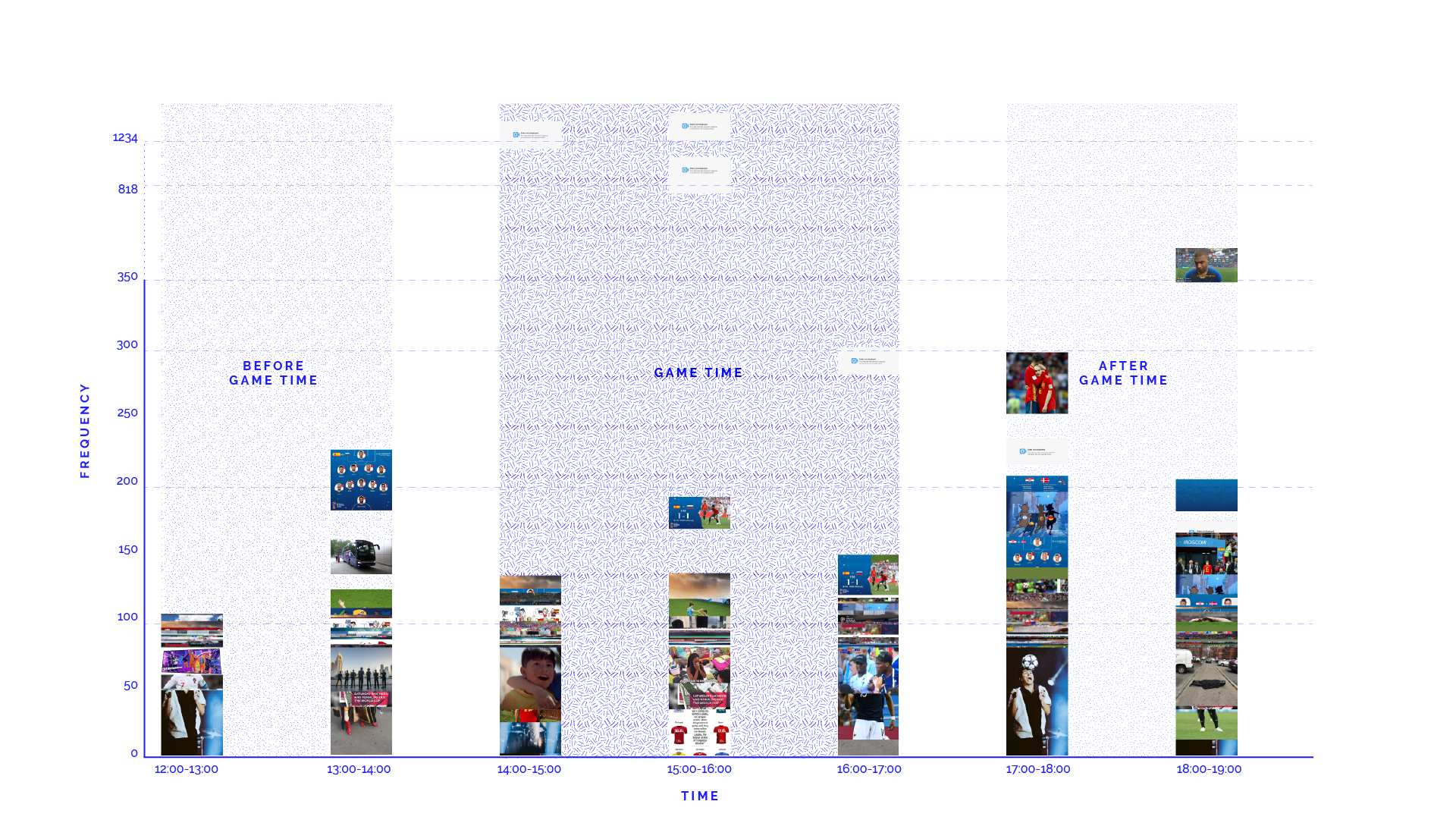
To better understand the specificities and similarities of different language-oriented publics, other time series show the circulation of images shared by ‘Spanish’ (Figure 9), ‘Russian’ (Figure 10) and ‘Japanese’ (Figure 11) speakers users (according to their “interface language”).

Figure 9 - Most shared images before, during and after Russia x Spain (Spanish “interface language” users)
The Spanish-language time serie highlights how heterogeneous is this language community. After the match, on one hand the sentiment of the Spanish supporters can be summarized by the picture of the player Iniesta leaving the pitch after his last match with the Spanish team. On the other hand, different memes make fun on the Spain’s defeat, what allow us to presume part of this 'linguistic community' was not supporting this national team. No women pictures were highly shared before, during or after the match.

Figure 10 - Most shared images before, during and after Russia x Spain (Russian “interface language” users)
The Russian-language image serie shows, before and during the match, mostly patriotic and celebrities images as well as pictures of supporters. After the penalty shoot-out, the goalkeeper Akinfeev is highly celebrated as the hero of the match.

Figure 11 - Most shared images before, during and after Russia x Spain (Japanese “interface language” users)
The time serie of Japanese-language shared images clearly has a different temporal dynamic if compared to the other ones. The non-involvement of the Japanese team in the match structure makes the sharing of images much less frequent than in the other two cases. Cartoons and manga-images are more shared here. Mostly due to the time zone (in Japan the game started late in the night), the amount of images decreased continuously and the most shared images are from or about prior watches.
6. Discussion
About the issuefication of the FIFA World Cup 2018 on Twitter, it was possible to find out how the tournament schedule (which defines moments when two national teams compete with each other) and the unpredictable events of sports strongly structured the involvement and the topics of different language publics. While the general number of tweets is narrowly correlated with the schedule and the events of the World Cup, this is less the case for publics whose team doesn’t participate; there (in our case Japan) the time zone (the patterns of everyday life) seem still to dominate.Concerning the quality of the visuals, the televised images with their focus on action and emotion seem to shape the users practices. The sharing of FIFA branded content and pictures by authorized photojournalists are also common, what suggests a issuefication (at least partially) aligned with the WC2018 official agenda. On the other hand, particular topics and visual styles are still recognizable for the different language publics. They are mostly centred around the sports event but give it a different perspective and outlook. In this sense, the use of the 'interface language' metadata to identify national or regional publics seems to have been more precise in the case of Japanese and Russian, which are mostly spoken in a single country. In the case of Spanish - the second most popular language in the world and the native language of 8 out of 32 national teams in the WC2018 -, the qualitative analysis of the tweets was especially important to identify the sharing of visuals by supporters pro and against the Spain squad. About the two methodological efforts, as expected they worked in complementary ways. In the image-label networks, the process of “cluster identification” led us to highlight the main ways in which Twitter users who tweeted the WC2018 terms/hashtags narrated the events. Obviously, this analysis does not take into account the temporal dimension but we found it very useful in order to have a glance on the entire visual production made by Twitter users. Additionally, the time series analysis was useful to connect this “ways of narration” to specific events before, during and after the match, and to understand which images were the most engaging for Twitter users.
Additionally, it is worth discussing the (expected) bias of Google Vision API labeling process. The cluster "Women" in Figure 3, for instance, was mainly labed by Google API with 'body parts' as well as are closer related to nodes about 'products'. 'Women' are also closer associated with cartoons, whereas there is even a node called ‘beauty’. As for the men, they are associated with the athletes and players, surrounded by general nodes about the 'forehead', 'nose', 'chin' and 'facial beard'. In this sense, a question that emerged is: why does the Google API identify women as materialistic and less human than their male counterparts?
7. Conclusions
The study was based on a english-oriented dataset (‘wc2018’, ‘fifawc’ and ‘worldcup’) but focused its analysis on how this terms/hashtags were appropriated by specific language publics. In this sense, one of the contributions of this study was better understanding how a (sort of) transnational WC2018 audience negotiated the shared meanings about the tournament or, more specifically, about an surprising match. This approach could be applied in depth in future studies, and its results may also be compared with more local/regional language-oriented datasets.
In terms of methodological efforts, it may be emphasized the potential of computer vision tools such as Google Vision API to process large datasets of images. However, in this case study the 'labels' provided automatically by this tool were too descriptive or generical (i.e. 'green', 'product', 'soccer'), what emphasizes the importance of proposing new ways to classify and/or clusterise a visual dataset. Applying machine-learning techniques to adapt the analysis to specific issues should be considered as a way to "retrain the machine" (theme of the Digital Methods Summer School 2018).
8. References
Borra, E., & Rieder, B. (2014). Programmed method: developing a toolset for capturing and analyzing tweets. Aslib Journal of Information Management, 66(3), 262–278.
Bruns, A., Weller, K., & Harrington, S. (2014). Twitter and Sports : Football Fandom in Emerging and Established Markets. In K. Weller, A. Bruns, J. Burgess, M. Mahrt, & C. Puschmann (Eds.), Twitter and Society (Vol. 89, pp. 263–280). New York: Peter Lang.
Couldry, N., & Hepp, A. (2017). The continuing lure of the mediated centre in times of deep mediatization: Media Events and its enduring legacy. Media, Culture & Society.
Evans, M. (2017). Media events in contexts of transition: sites of hope, disruption and protest. Media, Culture & Society.
Marres, N. (2015). Why Map Issues? On Controversy Analysis as a Digital Method. Science, Technology & Human Values, 40(5), 655–686.
Rogers, Simon. ‘Insights into the #WorldCup Conversation on Twitter’. Twitter Blog (blog), July 14, 2014. https://blog.twitter.com/official/en_us/a/2014/insights-into-the-worldcup-conversation-on-twitter.html
Sloan, L. (2016). Social science lite? deriving demographic proxies from twitter. In Sloan, L., & Quan-Haase, A. The SAGE Handbook of social media research methods (pp. 90-104). 55 City Road, London: SAGE Publications Ltd. doi: 10.4135/9781473983847
For more, see Project initial proposal and the slides presentation


| I | Attachment | Action | Size | Date | Who | Comment |
|---|---|---|---|---|---|---|
| |
1weekimagelabenet.jpg | manage | 137 K | 31 Jul 2018 - 18:23 | CarlosDandrea | |
| |
July1 seven hours_trendline-01.jpg | manage | 2 MB | 31 Jul 2018 - 18:56 | CarlosDandrea | |
| |
Most shared photos Overall_SpainvsRus.svg | manage | 2 MB | 01 Aug 2018 - 20:10 | CarlosDandrea | |
| |
imageplot_7hours__ES.png | manage | 603 K | 31 Jul 2018 - 18:56 | CarlosDandrea | |
| |
imageplot_7hours__JP.png | manage | 512 K | 31 Jul 2018 - 18:56 | CarlosDandrea | |
| |
imageplot_7hours__Russ.png | manage | 505 K | 31 Jul 2018 - 18:56 | CarlosDandrea | |
| |
imageplot_7hours__all languages.png | manage | 564 K | 31 Jul 2018 - 18:56 | CarlosDandrea | |
| |
protocol.png | manage | 28 K | 03 Aug 2018 - 12:16 | CarlosDandrea | |
| |
russiavsspain_japanese-01.png | manage | 11 MB | 31 Jul 2018 - 18:29 | CarlosDandrea | |
| |
russiavsspain_russian-01.png | manage | 3 MB | 31 Jul 2018 - 18:32 | CarlosDandrea | |
| |
russiavsspain_spanish-01.png | manage | 4 MB | 31 Jul 2018 - 18:32 | CarlosDandrea |
Ideas, requests, problems regarding Foswiki? Send feedback